
The 16 kitchens below run from a 30-square-foot multi-tasking island to a full Venetian plaster range hood, and the one that belongs to you depends on how much daily discipline you will actually hold yourself to. Open shelving and glass-front cabinets only work if you style them every morning; the payoff is a room that feels larger, but one mail pile undoes the whole effect. Paean Black cabinetry, Behr’s Cracked Pepper, or a deep yellow Zellige backsplash each demand that same consistency, or they become clutter you cannot hide.
1. Modern Marvel
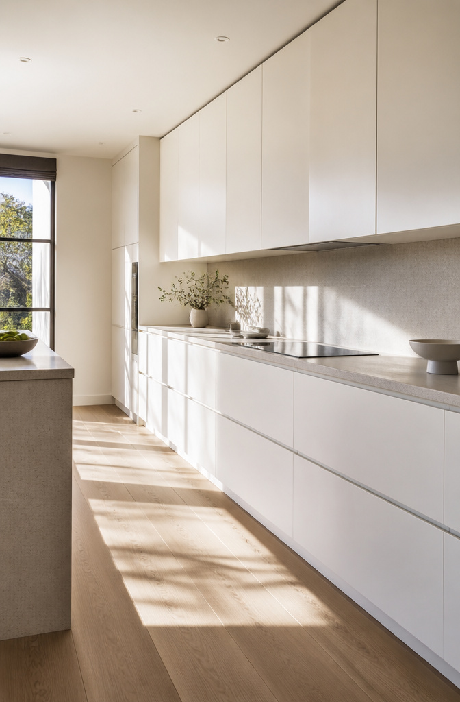
Handleless cabinets read as a single quiet plane rather than a grid of boxes, and that is the move that defines this style. The hardware disappears, the finger-pull groove is routed into the underside of the door or drawer front, and the whole run keeps its line from end to end. Bright monochromatic layouts push the effect further, reflecting light back into the room and making a small kitchen feel like it has breathing room. Bold glossy schemes do the opposite work, turning the cabinetry into a solid visual statement that holds the space together.
What makes or breaks it is storage. Streamlined silhouettes only stay sleek when nothing sits on the counter that could live behind a door. Every appliance needs a berth out of sight, and the design only functions if there is enough of it. In real kitchens that means planning for more concealed storage than you think you need, because one mail pile or coffee maker left in the open undoes the whole intention. Ample concealed storage is the requirement here, not the suggestion, and clutter is the single thing that ruins the look immediately.
2. Rustic Charm
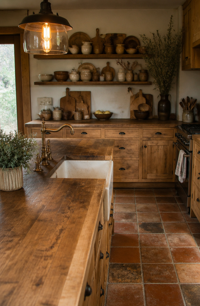
A kitchen that actually feels lived-in starts with wood left honest enough to show its grain. I keep coming back to butcher block for this reason: the surface dents, darkens near the sink, and after a year or two it carries the history of actual meals. That patina is the point, not a flaw to sand out.
Vintage-inspired lighting does the heavy lifting for warmth. A pendant with visible filament over a farmhouse sink, or a pair of schoolhouse globes above an island, throws the kind of uneven light that flat LEDs never quite match. The shadows it creates matter as much as the glow.
Earthy tones and handmade tiles layer in texture without clutter. Open shelving helps here, since stacked plates and worn cutting boards become part of the visual fabric. The risk is making it feel staged; the trick is mixing in the everyday tools you actually reach for.
3. Vintage Vibes
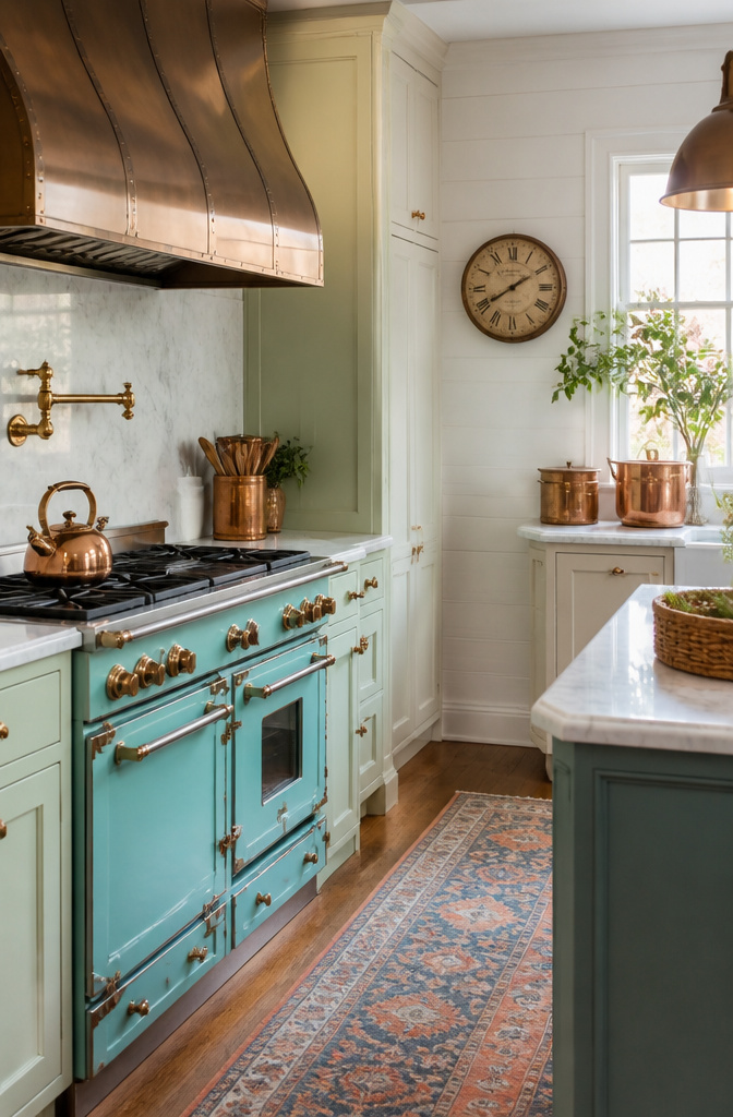
Retro appliances and classic color schemes keep surfacing in the kitchens I study, and the ones that work do not pretend it is still 1954. Designer Amber Lewis once talked a client down from a bright yellow kitchen and toward patinaed copper and Calacatta marble mixed with painted cabinetry. The vintage read came through warmth and wear, not period cosplay. That is the line: old-world materials against clean, current construction.
Brass and copper metals, marble paired with soapstone, a vintage runner on the floor, these soften the hard edges of a working kitchen without turning it into a set piece. The functional parts stay modern. The feeling does not. White cabinets with black countertops hold the same tension, a 1950s silhouette in a layout built for how people actually cook now. Patterned backsplashes and unique light fixtures finish it, though I would keep the palette tight. Visual noise kills the nostalgia and leaves only clutter. One or two authentic notes, a copper hood, a runner you found secondhand, read as intention. A room full of them reads as theme.
4. Eclectic Elegance

The first time I tried mixing patterns in a kitchen, I treated every surface like a blank canvas screaming for attention. Moroccan tiles fought with a striped runner and the whole room pulsed like a headache. The background stays quiet so the statement pieces can speak is a rule I learned the hard way. Inky navy cabinets, like the ones Heather French used to anchor her layered space, give patterns something solid to push against. A white foundation with a single pale blue range or a honey oak island adds warmth without starting a riot. The mix works when one element, usually the largest plane, agrees to disappear. Let the Berber rug or the bold backsplash be the story; the cabinets and walls are just the sentence it sits in. Start with two pieces you love from different origins, keep them separated by a calm surface, and stop before a third voice tries to join.
5. Open Shelving
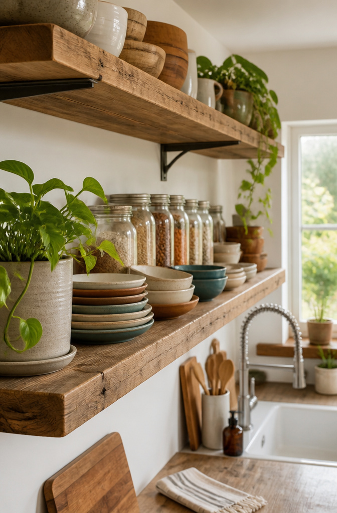
Open shelving trades upper cabinets for wall-mounted planks that keep dishes visible and within arm’s reach. The look opens up a kitchen visually, making the room feel larger than the same footprint with closed boxes overhead.
Daily use demands discipline. Plates you grab three times a day stay accessible; the holiday platter you use twice a year earns its spot only if you genuinely want to look at it. What convinced me, reading through a dozen of these kitchen stories, is that open shelving works when you commit to uniform containers or a color-arranged system that reads as intentional, not accumulated. Otherwise dust settles, grease films over, and the display sours into clutter.
The tension is real: one homeowner praised the look in country kitchens but admitted past open shelves were "a pain to keep organized." That squares with what the images show. Special-occasion pieces become decor you live with; everyday items become decor you judge yourself by. No hidden jumble exists.
6. Bold Color Cabinets

White cabinets still dominate most kitchens I walk into, and that safe choice is exactly why a saturated cabinet color lands with real force. Paean Black reads as near-black with depth that flat paint cannot touch, and on cabinetry it turns ordinary box construction into the room’s single most memorable surface. The risk is not the darkness itself but letting it swallow the space.
Pairing is what makes it livable. Sources that track what actually gets installed note that bold cabinets hold up best against restrained countertops, think stone or quartz in a quiet tone that lets the cabinetry do the talking without starting a shouting match. Two-tone layouts stretch this further, mixing the statement color on lowers with something lighter above, or wrapping an island in Paean Black while perimeter cabinets stay soft. Either approach keeps the drama from exhausting the eye by month three.
Color of the Year selections for 2026 are pushing this direction hard, with deep blues and near-blacks already filtering from showrooms into real projects. The commitment level matters. A full kitchen in Paean Black is a decision you live with for years; an island or a single bank of tall cabinets tests the water without the same stakes.
7. Glass-Front Cabinets
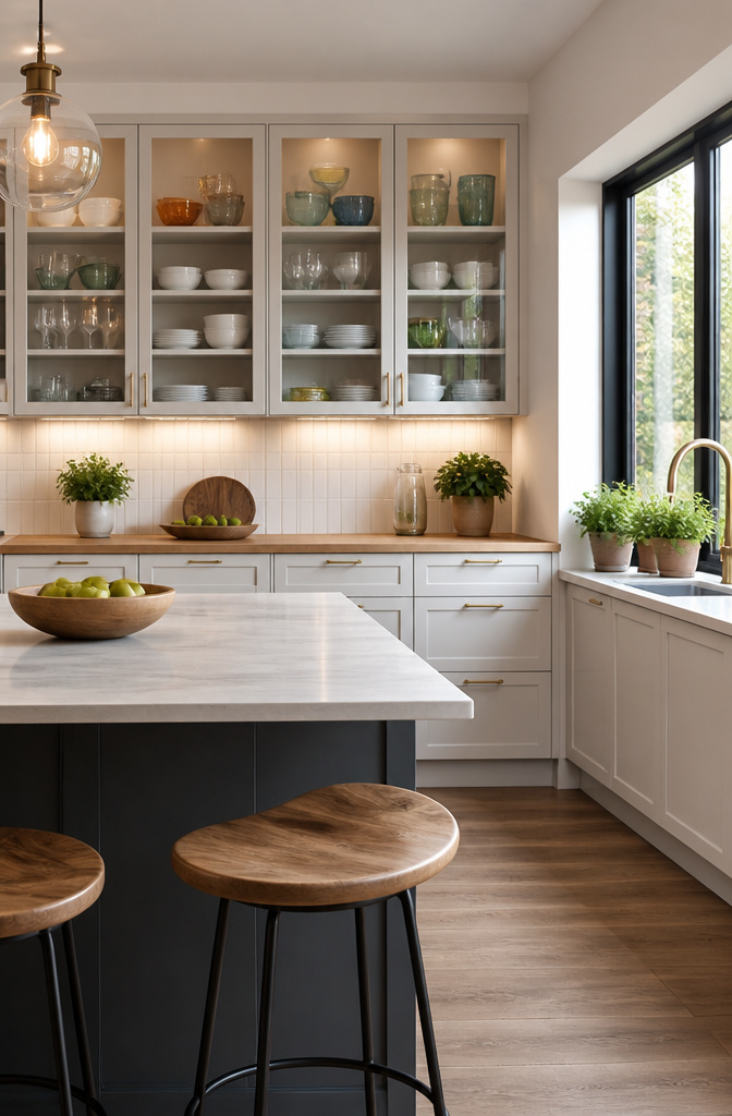
Glass-front cabinets lighten a wall of solid cabinetry without giving up enclosed storage entirely. The glass panel interrupts the mass, lets your eye travel deeper into the room, and turns everyday dishes into something worth looking at. That depth is real: light passes through rather than stopping at a flat surface, so the kitchen reads larger than the same footprint in all-wood doors.
The catch is what sits behind that glass. Everything on display needs to earn its place, or the effect flips from curated to cluttered in about a week. Two ways to play this. Clear glass demands discipline: stack plates by color, line up glasses by height, and accept that the cereal boxes live behind solid doors. Reeded or seeded glass offers more forgiveness; the texture breaks up the visual noise so a little everyday mess reads as shadow rather than chaos. You still need order back there, but you do not need to style it to perfection every morning.
Lighting inside the cabinet changes the equation entirely. Without it, glass doors go dark and flat after sunset. With it, the contents glow and the kitchen picks up a second layer of light after the overheads dim. The hardware cost is modest; the effect is what sells the choice.
8. Timeless Allure

Shaker-style cabinets still carry the kitchen because the joinery does not pretend to be anything other than wood meeting wood. The flat panel and square rail read as honest construction, not a period costume, which is why they survive shifts from farmhouse to city loft without looking lost. I keep coming back to them when a client wants the room to outlast the year they bought it.
Subway tiles work on the same principle. The 3-by-6 rectangle has been around since the early 1900s because it does one job: it protects the wall and recedes enough to let the cooking and the people dominate. Gloss white is the default for a reason, but the format also takes color without becoming a novelty.
Where the balance tips toward now is in the pairing. Deeply veined marble on a Shaker cabinet adds tension, the stone moving while the frame stays still. Two-tone paint does the same trick at lower cost: muddy gray on the cabinetry against a lighter limewash wall keeps the bones traditional but the mood current. The limewash is the move that saves it from looking like a reproduction.
A classic chandelier or a streamlined pendant over the island finishes the bridge between eras. The fixture is the one place where you can date the room deliberately, and pulling it back toward modern keeps the cabinets from reading as a museum piece.
9. Waterfall Islands

A waterfall island drapes the countertop material down both vertical sides, turning a horizontal work surface into a sculptural piece that reads as solid stone or quartz rather than a cabinet topped with a slab. The effect works best when the material itself carries interest: heavy veining in marble, dramatic movement in granite, or a bold aggregate in engineered stone all gain presence from the extra real estate.
Choose a durable material for the waterfall edge, because the sides take more knocks from knees, chairs, and passing traffic than the top ever will. In a galley layout, running that island perpendicular to the main cooking corridor carves out distinct zones without blocking the path between kitchen and living areas. The visual weight anchors the room, but the payoff is purely aesthetic; you sacrifice the casual seating overhang of a standard island, and the fabrication cost runs higher with all that additional cutting and finishing. For a kitchen where the island sits central and visible from multiple rooms, the trade is usually worth it.
10. Multi-Functional Islands
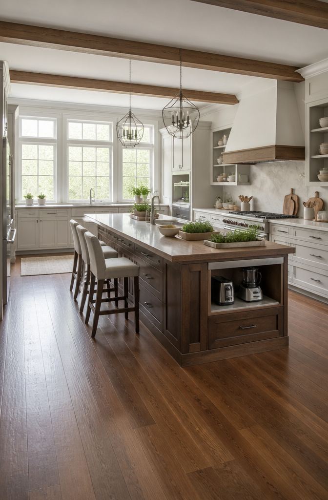
The island I ended up with does three jobs and barely breaks 30 square feet. One side holds drawers deep enough for sheet pans and the mixer, the other side has a 12-inch overhang where two people can eat breakfast without bumping knees into cabinets. That overhang depth matters more than most people guess; anything under 10 inches and your plate sits too close to the edge.
A pop-up shelf set into the island changes how you use small appliances. The stand mixer lives in that bay, plugged in, ready to lift into place when you need it and drop out of sight when you do not. I would not build an island now without at least one integrated outlet, preferably on both ends, because the thing becomes a charging station and a cooking station and you will fight over the single plug.
For tighter kitchens, a mobile island on casters lets you roll the whole unit aside after dinner, opening the floor for guests or just for walking through without the sideways shuffle. The Martha’s Vineyard setup that does this with a dining table on casters convinced me the idea works for islands too: prep where you need it, dine where you need it, then store it against the wall.
Concealed storage keeps the surface clear. Drawers beat doors for everything below waist height; you see the contents without crouching. A hidden mini-fridge in the island footprint costs more than the standard cabinet, but it keeps wine and vegetables out of the main refrigerator traffic pattern, and that matters in a busy kitchen.
11. Statement Range Hoods
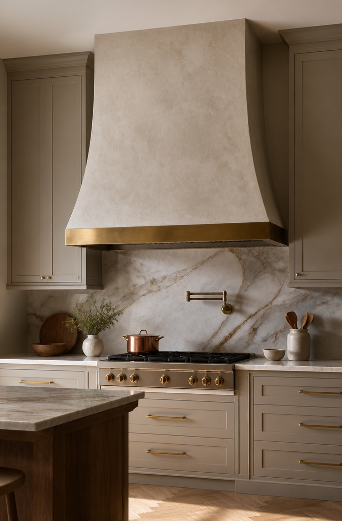
A range hood does not have to disappear into the cabinets. In one kitchen I kept returning to in my reading, a custom Venetian plaster treatment turned the hood into the room’s defining architectural moment, something that pulls the eye the moment you walk in.
Proportion matters more than ornament. A hood that is too slim above a 48-inch range looks like an afterthought; one that carries visual weight down to the cooking surface anchors the whole wall. Material choice does the heavy lifting. Brass reads as jewelry. Limewash softens the edges. A copper backsplash, borrowed from older house architecture, can extend the hood’s presence so it does not float alone.
Color works too, though it needs restraint. A bubblegum pink range with a matching pink-and-white cabana stripe on the hood tips quickly into costume unless the surrounding finishes pull it back. Antique brass, wood, emerald quartzite, those are the counterweights that let the hood stay bold without turning the kitchen into a set piece.
The move I would actually make: pick the material first, let everything else respond to it. The hood sets the tone. The cabinets, the pendants, the island, they are supporting actors.
12. Textured Backsplashes

Standard subway tile has its place, but the flat plane reads as one continuous surface. Texture breaks that up, catching light from windows and under-cabinet fixtures at different angles so the wall shifts as you move through the room. Ann Sacks makes tiles with uneven surfaces where each piece carries its own slight variation in hue; set together, they read almost like bark or weathered stone rather than a manufactured grid.
Zellige tile works the same way. The hand-cut edges and glazed surface throw small, unpredictable reflections. In one kitchen, a deep yellow Zellige backsplash sits against a green island, and the contrast gains depth from the tile’s gloss rather than from pattern or color alone.
For something rougher, copper or painted tin pick up the architecture of an older house. A copper backsplash darkens where it meets the stove, polishes brighter near the sink, and records the room’s use in a way polished stone never does. Tin ceiling panels, flipped to the wall, carry the same raised pattern they would overhead.
The risk is choosing texture for its own sake. A heavily dimensional tile behind a range collects grease in its recesses. Smooth enough to wipe down, rough enough to catch the light is the balance that survives actual cooking.
13. Cozy Banquettes

A built-in banquette turns the dead zone along a wall into actual seating without the chair-leg clutter that makes a narrow kitchen impossible to walk through. The Ibiza kitchen that pulled this off used a slim table with integrated bench seating tucked under the island, keeping the walkway clear while the lava stone tiles ran floor to counter for visual continuity. That continuity matters: when the bench is fixed and the materials match, the eye reads the whole strip as usable space rather than furniture crowding a corridor.
Freestanding banquettes suit renters or anyone who rearranges seasonally, but they eat two to three feet of circulation on every side. Built-in wins where the kitchen is the social hub, especially if you are already committing to custom cabinetry. The walnut and green slate kitchen designed by Commune paired its island with a second family seating area, turning the prep sink into a command center where the host never leaves the conversation. Two zones, one room, no one stranded at a separate table.
Where this can go wrong: a banquette deeper than 20 inches traps diners against the wall, and a back angle too upright turns dinner into punishment. Pitch the backrest slightly, keep the seat around 18 inches high, and treat the storage underneath as non-negotiable. Otherwise you have built a very heavy bench that does half a job.
14. Smart Layouts

The work triangle still matters, but the numbers need breathing room. In a tight kitchen, the old 4–9 foot rule between sink, stove, and fridge squeezes down to 36–48 inches of clear walkway and still functions. I learned this reading through layout after layout where designers treated the triangle as gospel and ended up with dead corners or blocked drawers.
A galley kitchen gives you two parallel runs and no corner cabinets to wrestle with. The catch is the aisle width; go under 36 inches and two people cannot pass, but push past 48 and you are taking space from storage you probably need. For a single cook, 42 inches hits the balance.
L-shaped layouts handle the reality of open-plan living better. The third leg of the triangle becomes an island or a peninsula, which means the refrigerator can anchor the end wall without forcing the cook to cross the social zone every time someone wants a drink. What convinced me, reading through a dozen of these, was how often the island doubled as a landing spot for groceries and a barrier that kept guests out of the hot zone.
The U-shape traps efficiency into the smallest footprint. Three walls, no traffic through the triangle, and counter space that wraps the cook on two sides. It only works if the room is wide enough; under ten feet, the opening starts to feel like a tunnel and the base cabinets on the back wall fight for elbow room.
15. Color-Blocked Designs
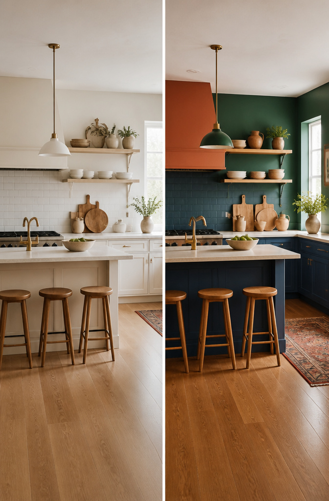
Color-blocking a kitchen means painting whole planes in flat, saturated hues so each zone reads as its own shape. Sawyers Design handled this by carrying the same palette through the rest of the house first; the kitchen then reads as intentional rather than random. The lesson there is anchor the boldest cabinets to colors already living in adjacent rooms, or the block effect tips into visual noise.
Two-tone cabinets split the contrast between upper and lower planes, which softens the geometry enough to live with. Decorilla’s designers pair those bold cabinets with neutral countertops as a hard limit; without that restraint, deep blues or bright oranges start competing with food and daylight for attention. Behr’s Cracked Pepper, from their 2026 Color of the Year selection, sits at the moody end if you want the block to recede rather than shout. Either way, pick two colors, not three. A third breaks the plane logic that makes blocking work.
16. Personalized Decor
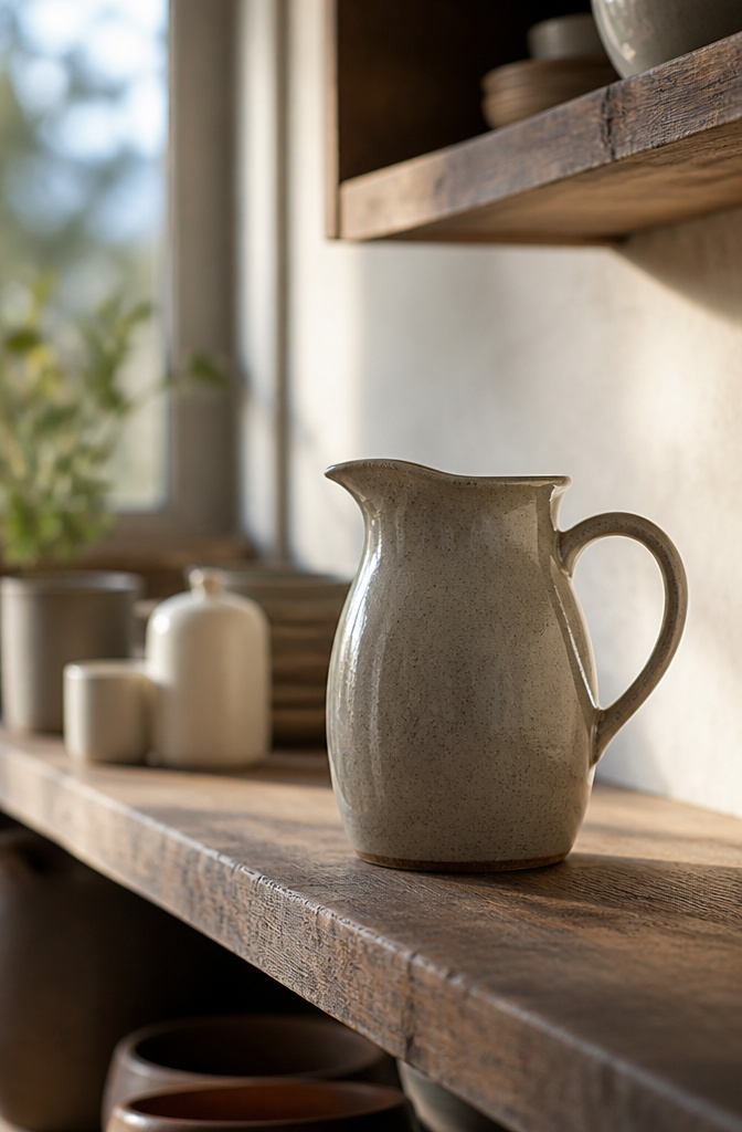
A kitchen that actually feels like yours starts with the objects you already own. The trick is giving them a frame that reads as intentional rather than scattered. Open shelving works best when it holds only what you use or what you love enough to dust; everything else needs a cabinet to hide in. I learned this the hard way after stacking every gifted mug I owned onto one long shelf, and the result looked less like a collection and more like a yard sale.
The sources that rank for kitchen inspiration design keep returning to the same tension: display versus clutter. One approach is to treat your cookware as the art itself. Patinaed pots hung above the stove add age and break up a neutral backsplash, but they need breathing room. Three pans read as curated; thirteen read as storage failure.
For collections that do not hang, the background matters more than the objects. A bold backsplash or vibrant cabinet color can carry an eclectic mix if the surfaces around it stay quiet. Moroccan tiles paired with a single Berber rug anchor the eye; add a second rug and the eye has nowhere to rest. The same rule holds for open shelves: arrange by color or use uniform containers, never both at once. Two systems competing on the same shelf turn curation into noise.
The limit is simpler than the sources sometimes admit. One statement piece per sightline, two at most in a large kitchen. More than that, and the room starts narrating too many stories at once.
Color Schemes That Hold Up
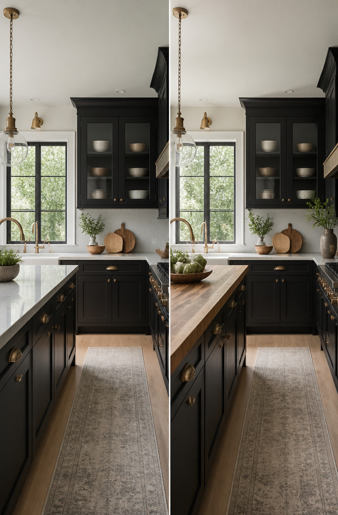
A kitchen painted in rich Paean Black reads as intentional the second you walk in. The cabinets become the architecture. What convinced me, reading through the dozen or so approaches that keep surfacing, is that bold color demands a neutral counterweight or the room starts shouting at itself. Deep blues, bright orange, even Behr’s Cracked Pepper from their Color of the Year 2026 selection, all of them need stone or plain wood somewhere nearby to settle the eye.
Fresh whites and soft grays work the opposite way. They set the scene for morning coffee and evening cleanup without competing for attention, and they forgive a change in dish towels or a new kettle every few years. The same sources that push Paean Black for drama also note that two-tone cabinets, mixing color and material, split the difference if you cannot commit.
My own leaning, and this is where the reading tipped me, is that renters and the indecisive should steer toward the lighter end. A wall in vibrant yellow is a weekend project to undo. White cabinets with a contrasting black countertop, on the other hand, let you swap hardware or a backsplash later without starting over. Mood shifts; neutral stays flexible.
Materials I Actually Use
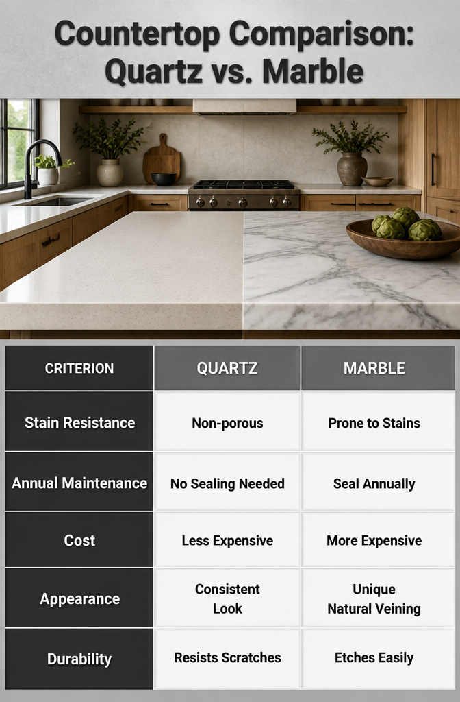
Quartz countertops carry the day if you spill wine or forget a hot pan. Engineered to be non-porous, they resist stains and scratches without the annual sealing ritual natural stone demands. A matte finish hides fingerprints better than gloss, which matters more than I expected once island seating became where everyone actually sits.
Marble stains. Etches. Costs more than it should for a surface that reacts to lemon juice like it is personal. Seal it annually or watch the damage accelerate. The payoff is visual: each slab is singular, and mixed with limewashed wood cabinetry the whole kitchen reads as intentional rather than safe.
Natural wood cabinets split the difference between painted and raw. In practice, wood shows wear faster near sinks and dishwashers, but the damage looks like use rather than failure. Two ways to play this: commit to marble as the statement and soften the rest, or put the money into quartz and skip the anxiety.
Storage Beyond the Cabinet

Upper cabinets eat wall space and bury half of what you own. Open shelving trades that bulk for air and utility: plates you reach for daily sit visible and within arm’s reach, while the back of a cabinet stops hiding the serving dish you forgot you had. The trick is curation. Uniform containers or a color arrangement keep it from looking like pantry overflow.
A kitchen island with storage built in does more than add counter space. Drawers, cabinets, even a concealed mini-fridge turn that footprint into a workhorse. The detail that convinced me, reading through enough of these setups, is the pop-up shelf for appliances: up when you need the mixer, down when you want clean counters. It solves the clutter problem without demanding another room.
For smaller kitchens, custom cabinetry is the move that makes the rest possible. Fixed shelves and standard widths leave gaps nothing fits. Built to the actual dimensions, the same wall holds more, and the island integrates seating without stealing prep space. The investment is in the measurement, not the ornament.
Light for Working and Living
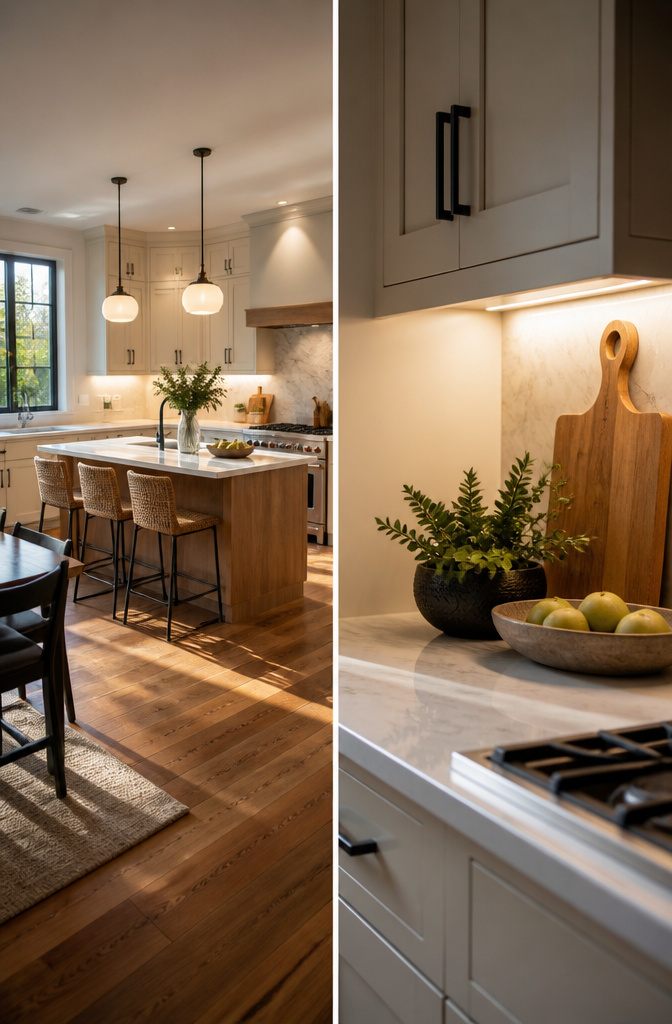
The harshest light in my kitchen used to sit directly over the sink, and washing dishes at 10 p.m. felt like an interrogation. 3500K bulbs under cabinets keep prep areas alert without that clinical sting, while dimmable 2700K pendants over the table let dinner feel like dinner. The mistake most people make is buying matching fixtures and calling it layered. Three sources of light at three heights does the work: task strips at counter level, a flush ambient wash from the ceiling, and those pendants or a sconce for warmth. Dimmers on every switch matter more than fixture price. You will use the bright setting maybe twenty minutes a day for chopping onions; the rest of the time you want to slide downward. Color consistency is the part that falls apart first. Mixing 2700K and 4000K in the same sight line makes the room feel broken, not designed. Pick one temperature family for task, stay within 200K of it for ambient, and let the dimmers do the actual mood work.
Frequently Asked Questions
What are the most popular kitchen design styles for inspiration?
Modern layouts with flat-front, handleless cabinets lead among the styles covered, followed by rustic kitchens built around honest wood grain and vintage looks that mix old-world materials with current construction. Eclectic elegance and timeless Shaker-style cabinetry also rank high in the projects profiled. The article notes that transitional design, blending clean lines with classic detailing, ages slowly and suits almost any home.
How do I turn kitchen inspiration images into a real design?
Look for elements that appear more than once in what you collect, since recurring details point to your genuine preference. Then let a style guide you, list what you need to purchase and do, and build from there. The article shows this in practice through designers who anchor bold choices to something already living in adjacent rooms, so the kitchen reads as intentional rather than random.
Where can I find good kitchen design inspiration?
Houzz holds millions of kitchen photos from designers and architects with saveable Ideabooks. Pinterest boards and HGTV galleries let you browse quickly across styles, while design platforms like Decorilla show full projects with the designer’s reasoning attached. The article also draws from finished designer spaces pitched to publications and, increasingly, AI-generated concept images circulating online.