Blue dining room decor covers everything from cloth napkins to a paneled feature wall and a tiered glass chandelier, and the right choice depends on which side of the day you eat on.
Pale blues read airy under morning light and turn flat after dark; deep slate stays rich at night but can feel heavy at noon.
1. Blue Napkins
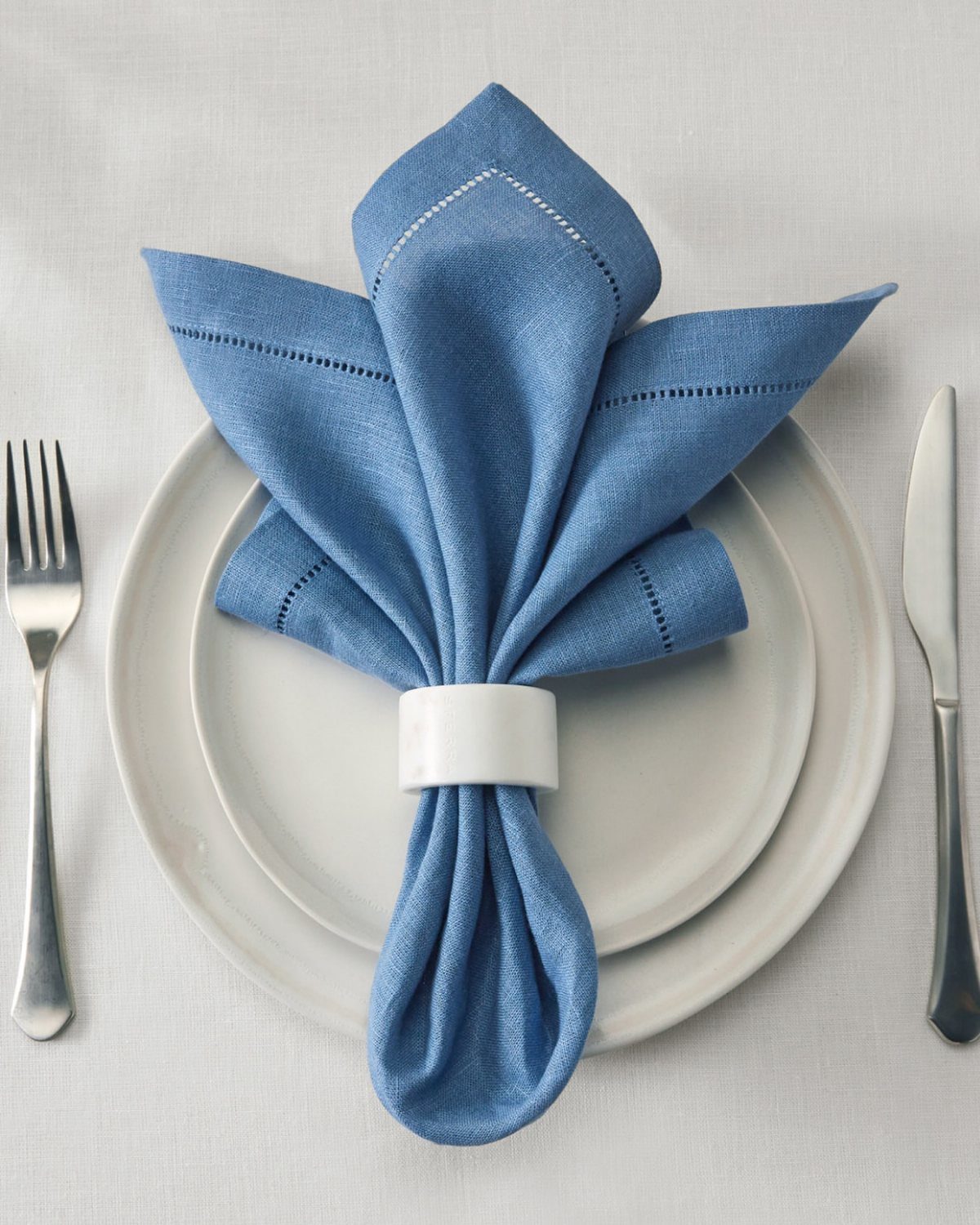
A blue napkin in a white ring turns a plain place setting into something intentional without buying a full new set. I like linen for this: it softens with washing and the color stays honest.
One set of rings the table for a modest price, and you can swap the napkins seasonally while the hardware stays. For a small space where storage matters, a drawer-sized stack of napkins goes a long way.
2. Blue with Yellow Dining Space

Blue and yellow sit opposite each other on the color wheel, which means they sharpen each other without either one shouting.
Keep the blue on the walls and chairs, then drop the yellow in a single pendant overhead; that concentration keeps it from feeling like a nursery.
I would start with the blue fixed and add yellow last, one piece at a time, since yellow reads brighter in a dining room than you expect.
A lamp, a vase, or a single chair works before you commit to anything larger.
3. Blue Wallpaper
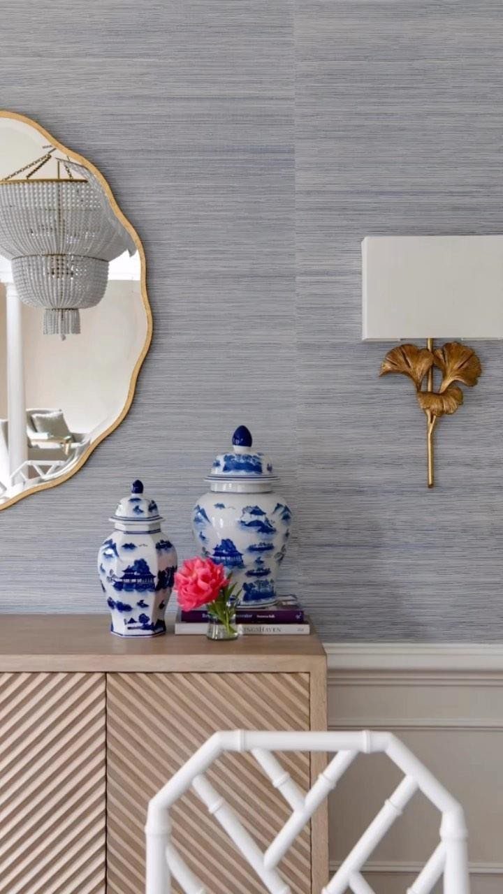
Textured wallpaper catches light across a whole wall in a way flat paint cannot, and blue in a subtle pattern reads as color without demanding a theme.
Peel-and-stick rolls are priced reasonably now, and I have seen renters use them for years without damage. Smooth the wall first; texture underneath shows through and cheapens the whole effect.
4. Modern Furniture with Blue Accents
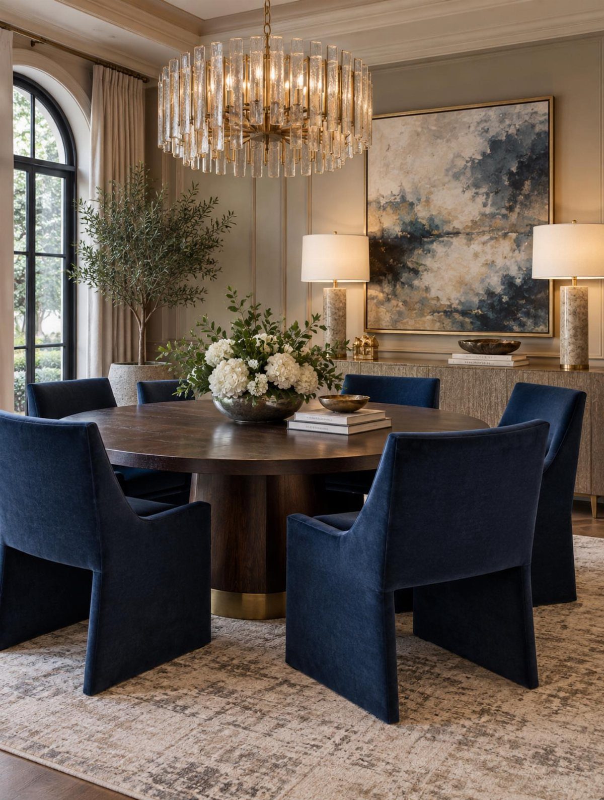
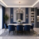
Dark velvet on modern chair frames gives you 2 things at once: the comfort of traditional upholstery and the clean lines that keep a small dining room from feeling crowded.
A crystal chandelier adds formality, but the chairs would read just as well under something simpler.
I would look for polyester velvet over cotton if you actually sit in them nightly; it resists water spots and cleans with a damp cloth.
A pair of armchairs at the table ends, with simpler seating along the sides, keeps the cost and the visual weight both in check.
5. Blue Artwork
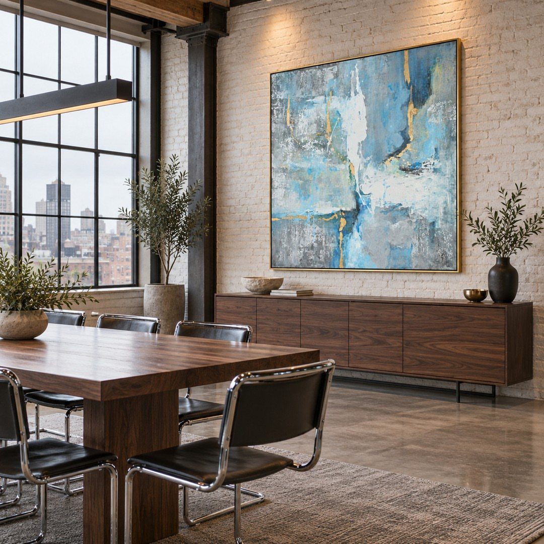
A single large piece of blue art on brick or plaster gives the eye one place to rest, which matters in a room full of hard surfaces and chairs.
Abstract work is what I prefer for dining rooms; representational work competes with food and conversation.
Size it to the furniture below, not the whole wall: the width of the sideboard or table, with breathing room on each side, is the frame width I aim for.
Command strips rated for the weight work on brick if you clean the mortar first and let it dry.
6. Go for Darker Blues
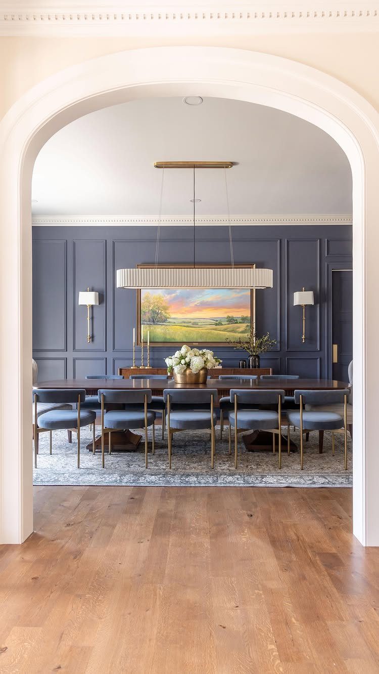
Deep slate blue on paneled walls shrinks a large room to human scale and hides the scuffs that lighter colors collect near chair backs. Brass fixtures warm it up; without metal or wood tones, dark blue can go cold.
I would test your shade at night, since dining rooms see more lamplight than daylight, and a color that reads cozy in the evening can look muddy by day.
2 coats of quality paint over primer is non-negotiable here; cheap coverage on dark walls turns chalky and catches every brush mark.
7. Blue with Warm Earthy Tones
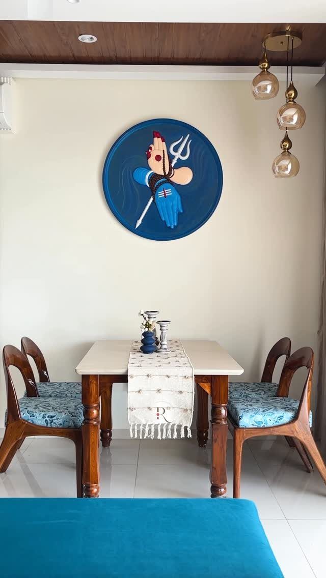
Wood and amber warm blue up without fighting it. Keeping blue to fabric and art while the table and lights bring in warm tones stops a cool color from feeling like a waiting room.
I would keep the wood natural rather than painted; stained oak or walnut has enough yellow in it to do the work.
For a small dining room on a budget, a wooden tray or a set of terracotta pots on the table costs little and does the same balancing.
From duck egg blue to deep navy, there is a wide variety of options when it comes to choosing the right shade for your blue dining room – all of them elegant, smart, and even warm.
8. Blue Chandeliers
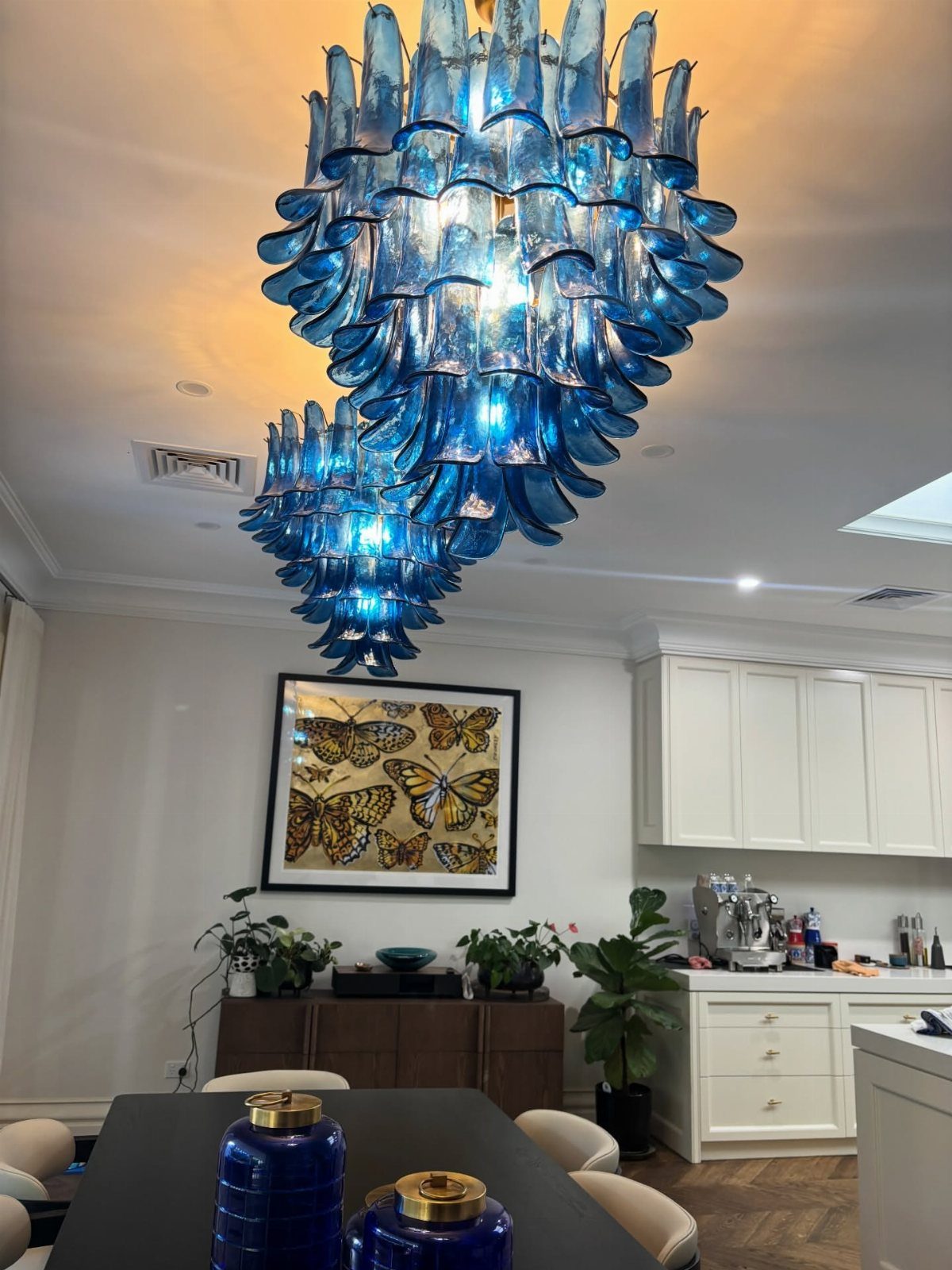
Blue glass in a chandelier throws color down in spots that shift as people move, which is livelier than a painted ceiling. Two tiered fixtures spread the color across a wide table where one would leave the ends dim.
I would check the drop height before ordering; blue glass reads heavier than clear and can feel low even at standard height. LED bulbs run cooler and protect the glass from heat stress over years.
9. Multiple Tones of Blue
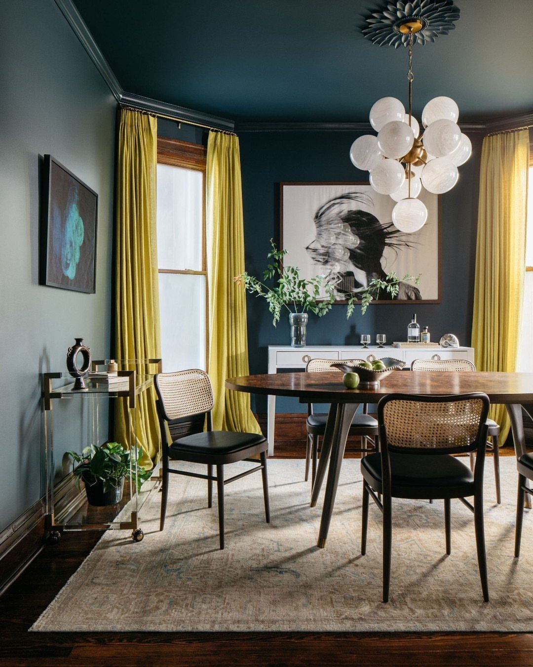
Ceiling and walls in different blues give a room depth that one flat color flattens out. Dark walls below and a lighter ceiling above pull the eye up and make the space feel finished rather than boxed in.
I would test both colors together on a poster board, not separately; 2 blues that look right alone can clash when they touch. Chartreuse curtains, if you want them, come last and in small yardage.
10. Blue Feature Wall
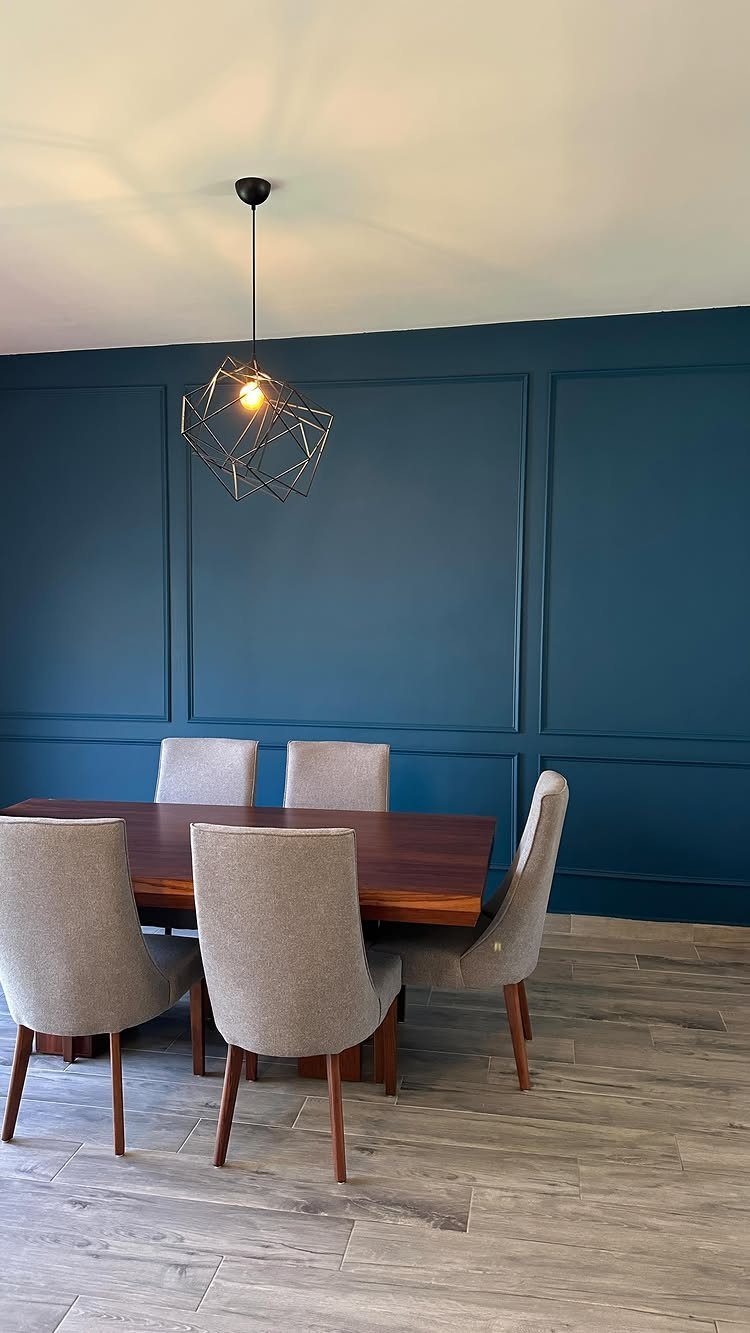
One paneled wall in deep blue gives a dining room an anchor without the commitment of four. Grey chairs and a light floor let the wall do the work; too much competing color would scatter the effect.
I would panel in MDF boards if the wall is flat, or use picture molding for the same grid look without the depth.
Paint the panel and the wall behind it the same shade; stopping at the edges breaks the illusion.
11. Blue and White Decor
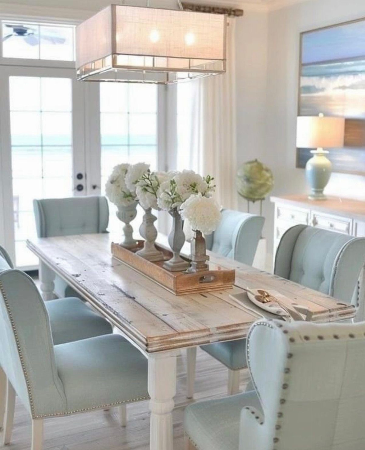
Blue and white survives trends because it reads as clean air and water, not as a statement. Pale chairs and a wood table keep it from feeling nautical; skip the rope and shells and the look holds for decades.
I would choose a blue with some grey in it for upholstery, since pure cobalt stains fast and shows every crumb. Linen or a linen blend cleans easier than cotton and softens the coastal edge.
12. Blue Upholstery
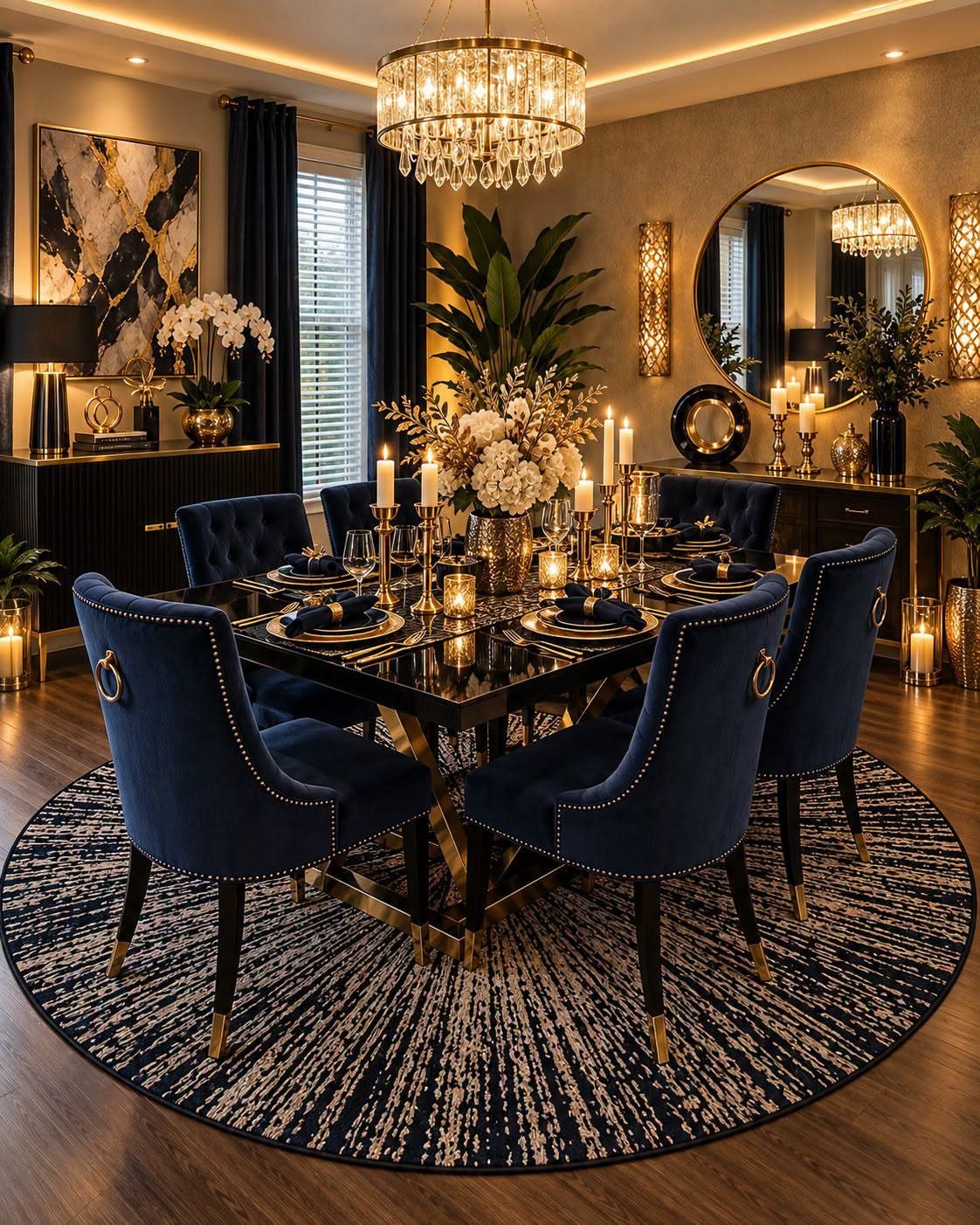
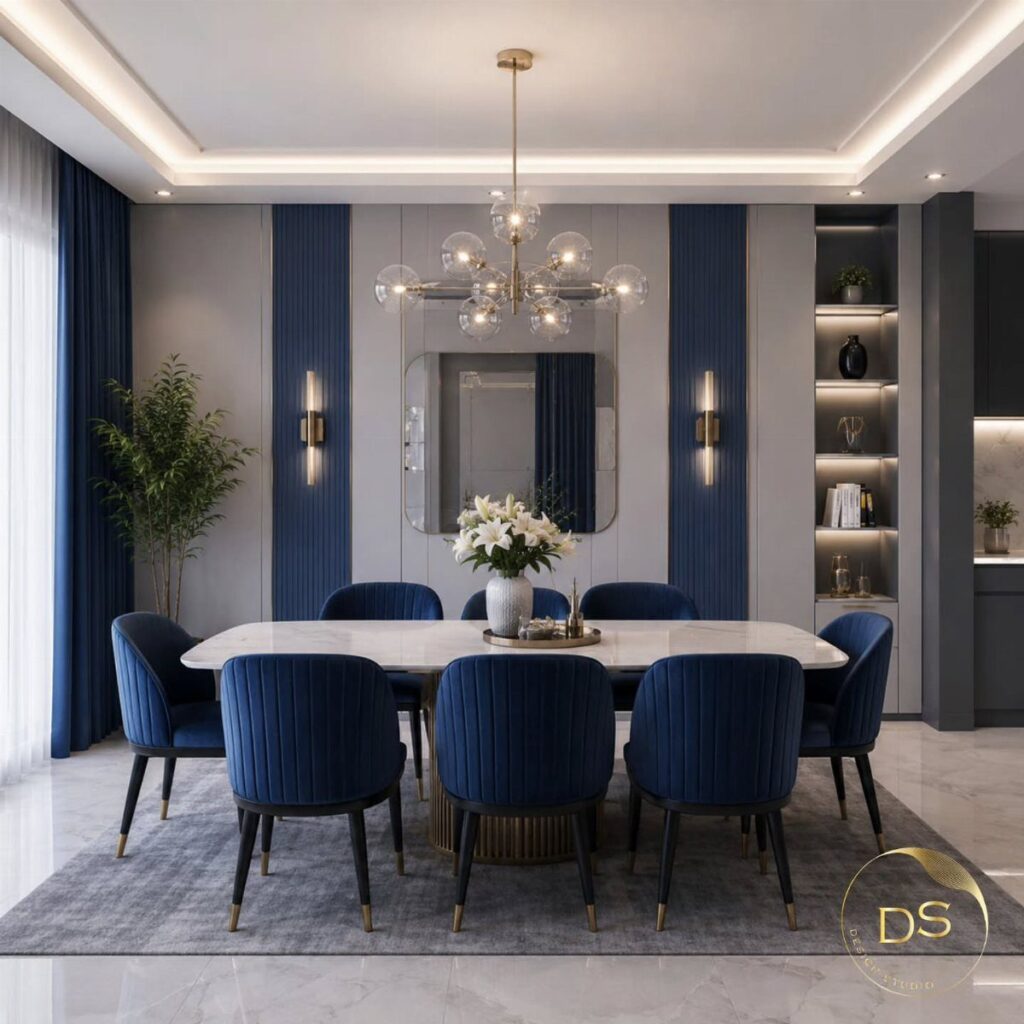
Navy velvet on dining chairs wears better than it looks; the pile hides small marks and the dark color buys you time between cleanings.
Gold rings add a handle for moving chairs without touching the fabric, which I would specify if I ordered custom. Poly velvet over cotton for daily use, same as Entry 4; the look is nearly identical and the maintenance drops.
A dark chair against a dark table needs the rug or the light fixture to separate them, or the whole ground plane sinks together.
Psychological Effects of Blue
Blue slows the body down.
Studies tie it to lower heart rate and blood pressure, which is why it works in a room meant for long meals and conversation. That same quality cuts appetite, though; red, orange, and yellow rev hunger where blue quiets it.
I would use that suppression deliberately if I ate too fast or too much, but I would think twice in a restaurant-style dining room built for celebration. The calm is the trade-off.
Choosing the Right Shade
Blue moves with the light more than most colors. Morning sun softens it into something airy; evening lamps sink it into something moody and dark.
I would pick the shade for the hour I use the room most. Day-dominant spaces want lighter blues that keep their character in sun.
Evening rooms can handle darker ones that turn rich instead of flat after dark. 2 tones together softens the whole effect, and a darker blue on woodwork instead of white adds depth without a second color.
Balancing Coolness
Blue runs cool by nature, and a dining room can feel like a waiting room if you let it. Warm wood, amber leather, or terracotta pots do the balancing.
I would keep the contrast low rather than vivid; yellow or orange against blue reads as opposition, where earthy undertones blend. Caramel and natural oak carry enough yellow to warm the space without fighting the blue.
Lightbulb choice matters too: a warm-toned bulb against blue walls reads cozier than daylight temperature. The goal is coziness, not temperature change.