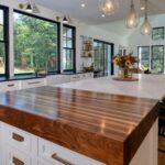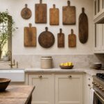
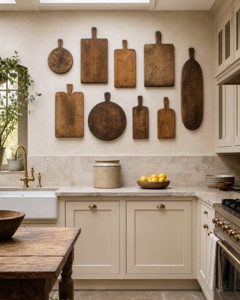
A country kitchen can run from a can of mineral oil for butcher block to custom cabinets that eat most of a renovation budget.
What decides your direction is whether you cook daily or gather more than you chop; the farmhouse sink’s porcelain overhang protects cabinet faces from drip damage only if you are actually standing there washing produce.
I keep coming back to the brass detail on that ZLINE range: black alone reads industrial, but those knobs warm the whole thing toward country without crossing into costume.
1. Open Shelving
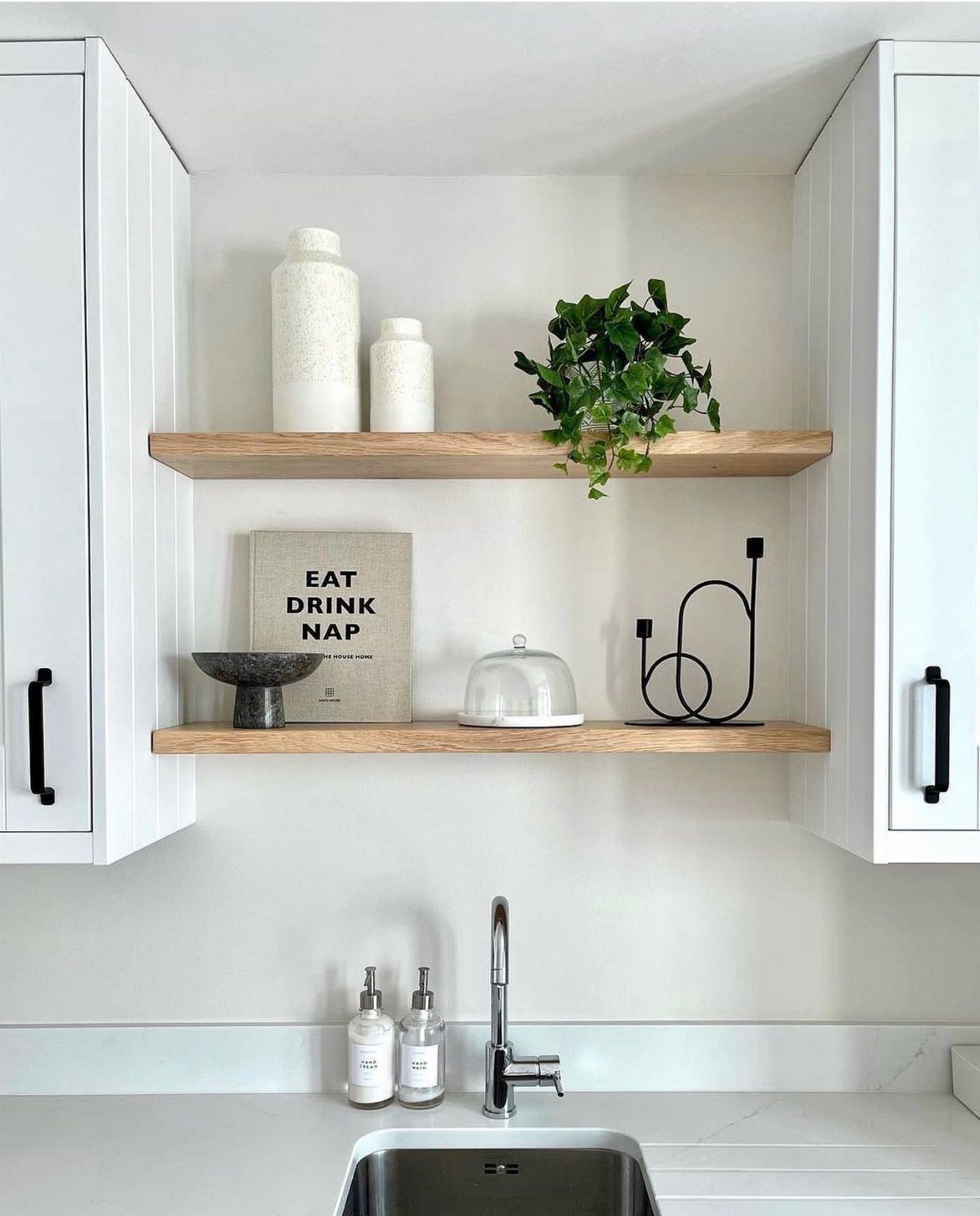
Open shelving turns your wall into usable storage without the cost of upper cabinets. I like it best above a sink or prep area, where you reach for dishes daily and the convenience pays off.
Editing what sits out makes or breaks the look.
A shelf crowded with mismatched plastic reads messy; a dozen pieces in two colors, mostly white and natural, reads intentional. Leave a third of each shelf empty.
If you rent, floating brackets in drywall anchors hold plates and small plants without tearing up the wall. For heavier loads, hit a stud.
2. Accent Colors
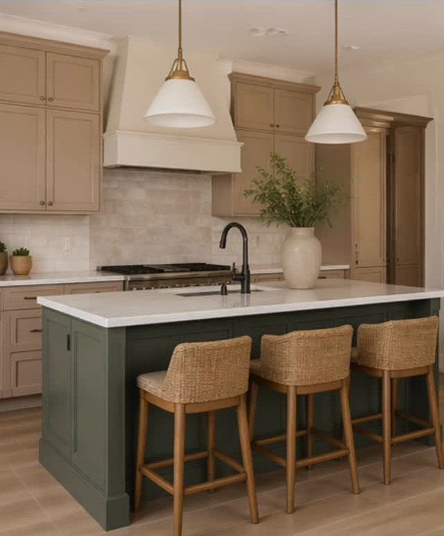
A single strong color against warm neutrals gives a country kitchen its backbone without busy pattern. A dark green island anchors beige cabinetry; the contrast draws the eye to the room’s center and hides scuffs better than pale paint.
Shiitake (SW 9173) works for perimeter cabinets because it reads as warm earth rather than gray, and it softens under natural light. I would test it beside your flooring before committing; it shifts noticeably next to orange-toned wood.
Woven stools complete the look at import retailers, though vintage finds last longer.
3. Farmhouse Sink
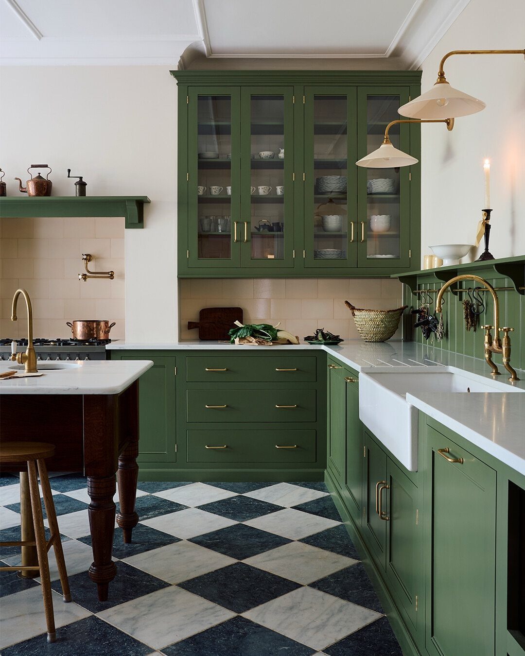
The apron front, or farmhouse sink, extends forward past the cabinet line so you lean against porcelain or fireclay rather than countertop edge. That overhang catches drips and protects cabinet faces, something you notice fast if you wash produce daily.
White stays the standard for a reason: it pairs with brass, black, or nickel fixtures without fighting. A white or cream basin keeps brass wall lamps from reading fussy.
Fireclay resists chips better than cast iron but rings when you set down pans. A rubber mat cuts the noise and protects the glaze.
4. Reclaimed Wood
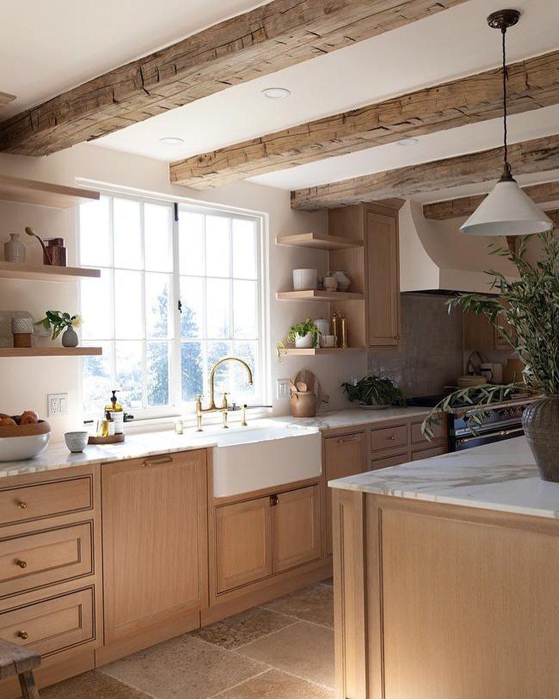
Ceiling beams in reclaimed wood add structure a new build lacks, and they need not carry actual weight to read as structural.
Weathered gray-brown timber against pale cabinets works because the wood’s tones pick up the floor rather than matching anything exactly.
Sourcing is the main cost.
Salvage yards in farm country sell century-old oak with the patina intact, and the price reflects the hauling and sorting. Planed and faux-aged new pine costs less but looks it up close.
I would budget for real material only on a ceiling you look up at often, and use new wood stained to match in secondary spaces.
5. Choose a Shaker Kitchen
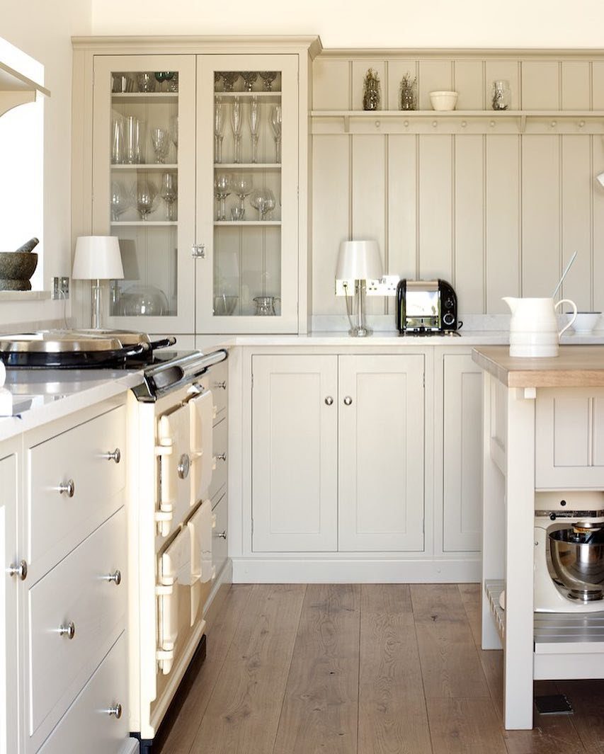
Shaker cabinets survive trend cycles because the frame-and-panel construction is honest: a flat center panel surrounded by a square-edged frame, no curves to date it.
Cream paint pairs this simplicity with a vintage-style range, and the 2 read as belonging to the same century.
The visible cabinets include glass doors on upper units, which I consider only if you own dishes worth displaying and the discipline to keep them orderly. Solid panel uppers store more and forgive more.
Painted Shaker shows brush marks less than raised-panel styles; this matters if you plan to touch up every few years.
6. Modern Appliances with Vintage Elements
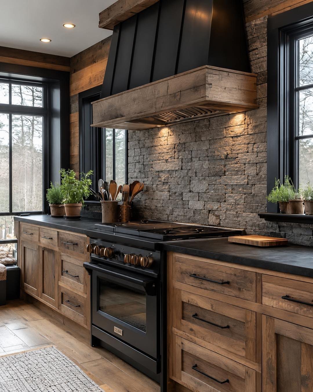
A black range with brass knobs gives you the look of a restored antique without the wiring headaches or uneven heating. That ZLINE unit keeps modern internals: convection, self-cleaning, a warranty you can actually claim.
The brass is the detail that sells it.
Black alone reads industrial; brass warms it toward country without crossing into costume. If your budget limits you to a standard stainless range, swapping factory knobs for aged brass ones is cheap and takes almost no time.
Stone backsplash and wood cabinets complete the pairing, though smooth stone behind the cooktop wipes down easier.
7. Custom Cabinets
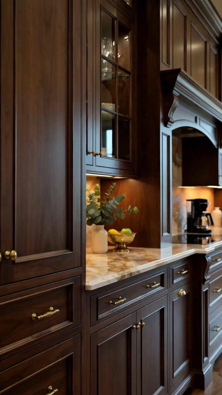
Custom cabinets fill the exact width of a wall and the precise height to your ceiling line, something stock boxes rarely manage without filler strips that read as afterthoughts.
Dark wood with brass pulls, as above, works best in a kitchen with strong natural light; in dim rooms the same combination can feel heavy.
Under-cabinet lighting, visible here, solves part of that for the work surface but not for the room’s mood.
I would put the money into drawer construction over door style: soft-close dovetail drawers in plywood last longer than any front detail.
8. Rustic Hardware
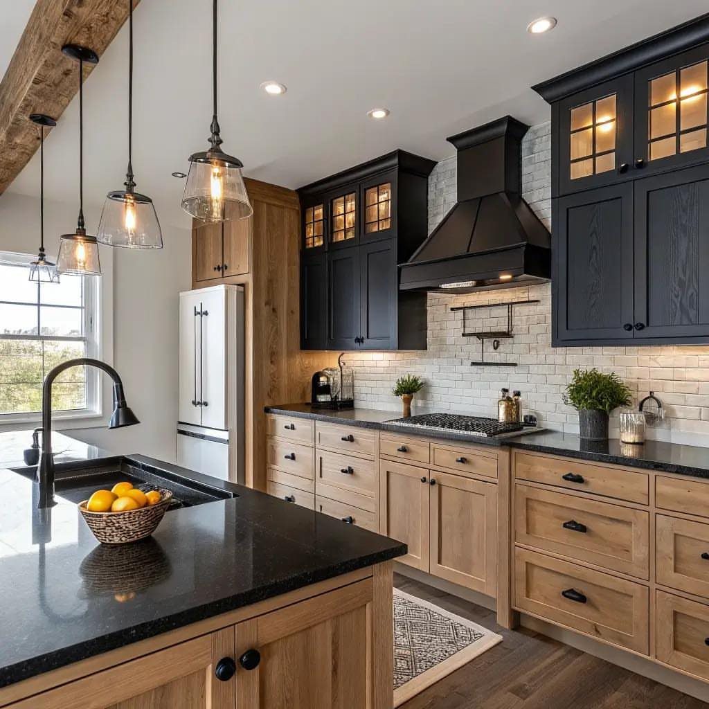
Wrought iron or oil-rubbed bronze pulls and knobs bridge old construction and new cabinetry without requiring either to pretend to be something else.
The black hardware against light wood lower cabinets, as above, creates enough contrast that you notice the material without the fixtures dominating.
Style grabs you at the store, but size decides whether the piece stays.
A pull that fits the drawer width looks intentional; one too long looks like a repair. I hold samples against my actual cabinet front before ordering, not against the sample board’s different scale and lighting.
9. Colorful Range Hood
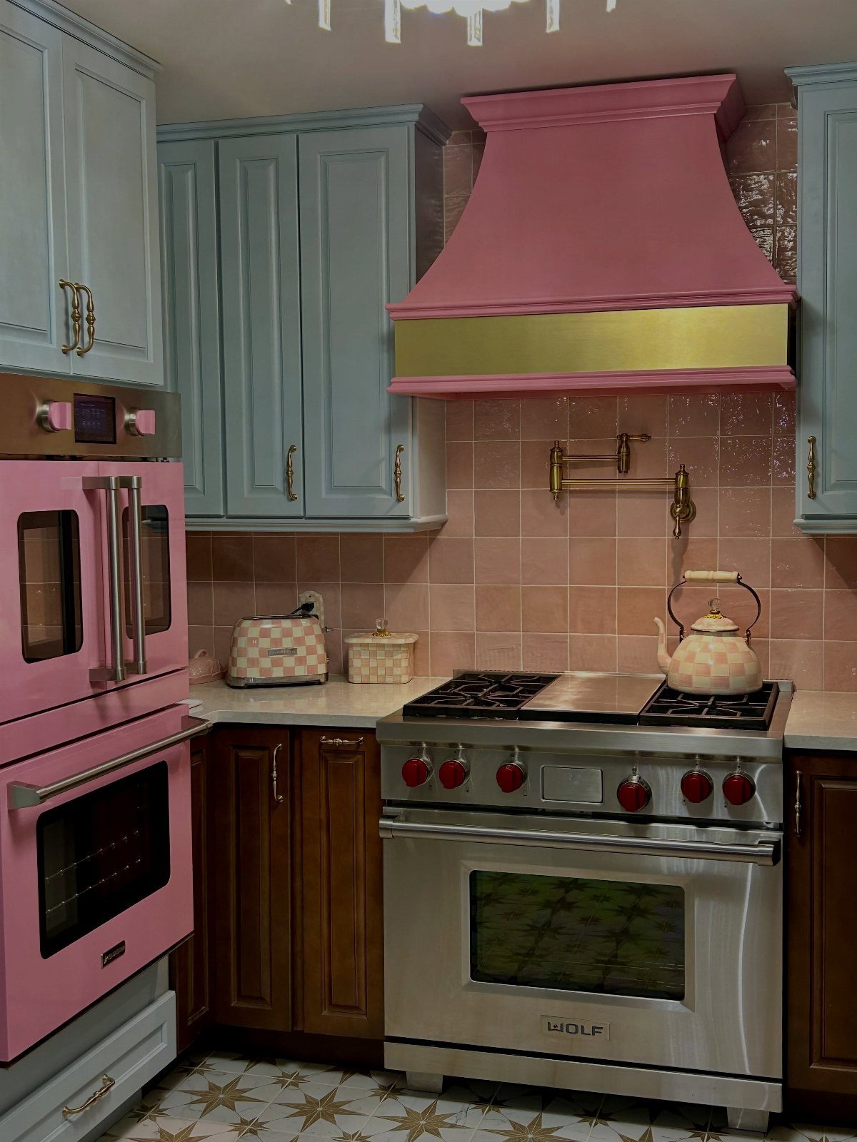
A range hood in a strong color, pink with brass trim above, claims the wall the way neutral appliances cannot. The hood becomes the room’s punctuation mark; everything else can stay quiet.
This works only if you commit to the choice.
A pink hood with safe beige everywhere else reads as mistake, not boldness. Carrying the backsplash color upward turns the hood into part of a system instead of an isolated shout.
I would choose the hood color last, after cabinets and counters are fixed, and match it to something already in the room rather than introducing a new hue.
10. Rustic Textiles
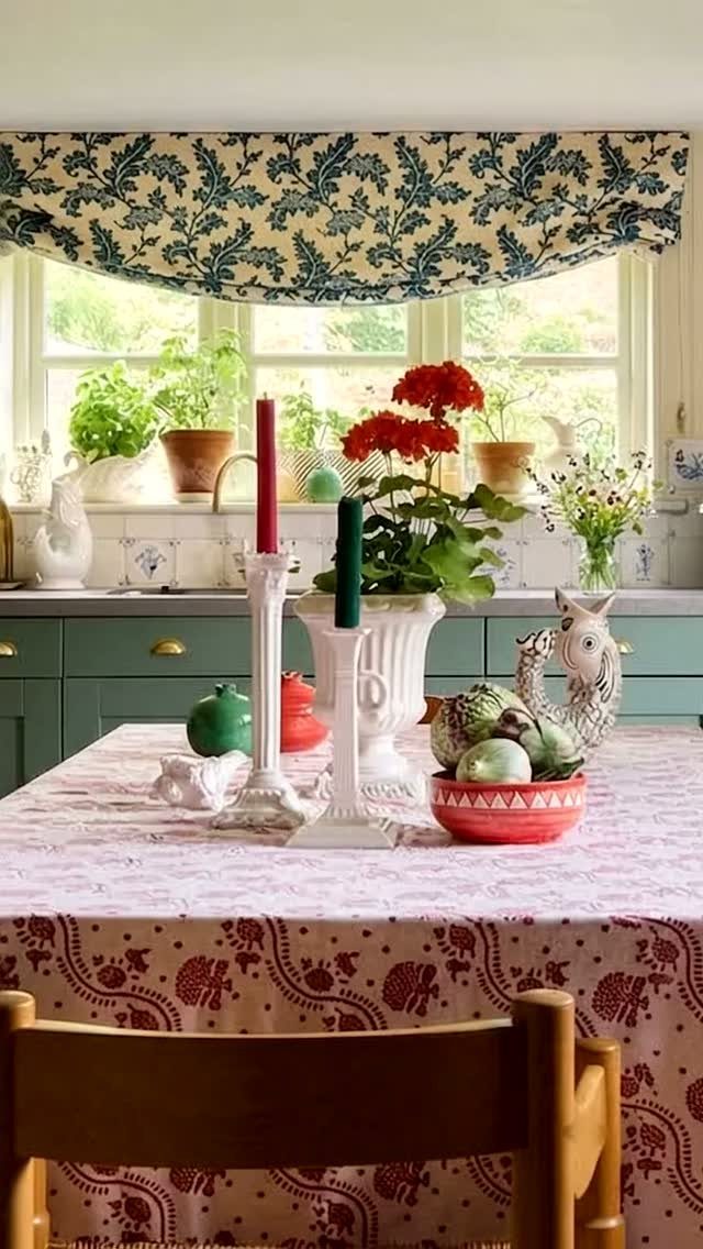
Patterned cotton or linen on windows and table breaks up the hard surfaces that dominate most kitchens. A valance and tablecloth that share a palette with painted cabinets feel gathered over time rather than bought as a set.
Washability is the practical limit.
A window valance sees less handling and can be pure linen; a tablecloth needs to survive weekly laundering or it becomes a special-occasion-only piece that lives in a drawer. I buy table linens I am willing to bleach.
11. All-wood Kitchen Island
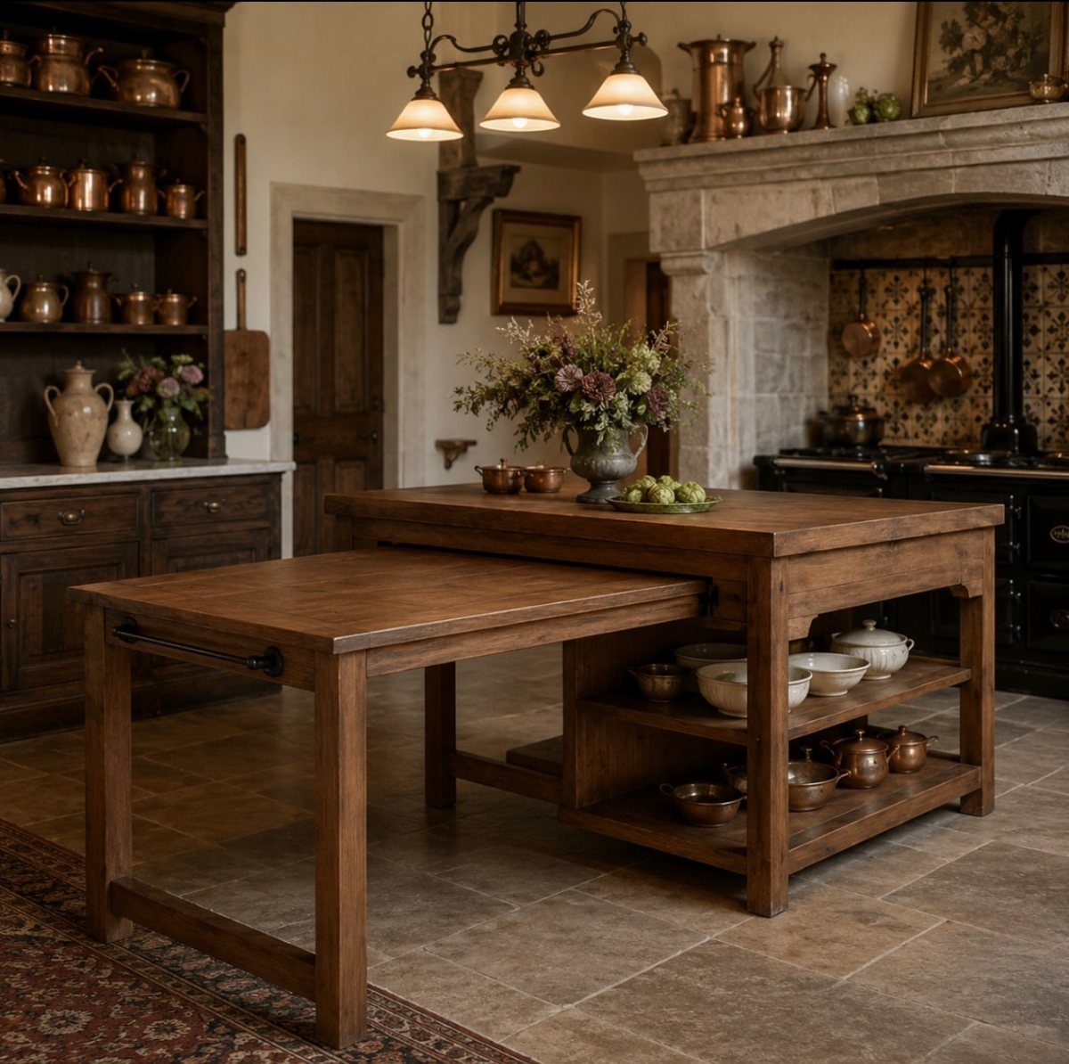
A solid wood island, built from the same material top to shelf, gives you a cutting surface, storage, and a place to lean that all age together.
A pull-out extension turns a compact prep area into seating for two without the permanent bulk of an attached overhang.
Open shelving below keeps bowls and copper within arm’s reach but demands restraint. I would limit it to items used weekly; anything less frequent collects the greasy dust that kitchens generate.
Stone floors, as here, ground the wood and handle the traffic that would scar softer material.
12. Farmhouse Lighting
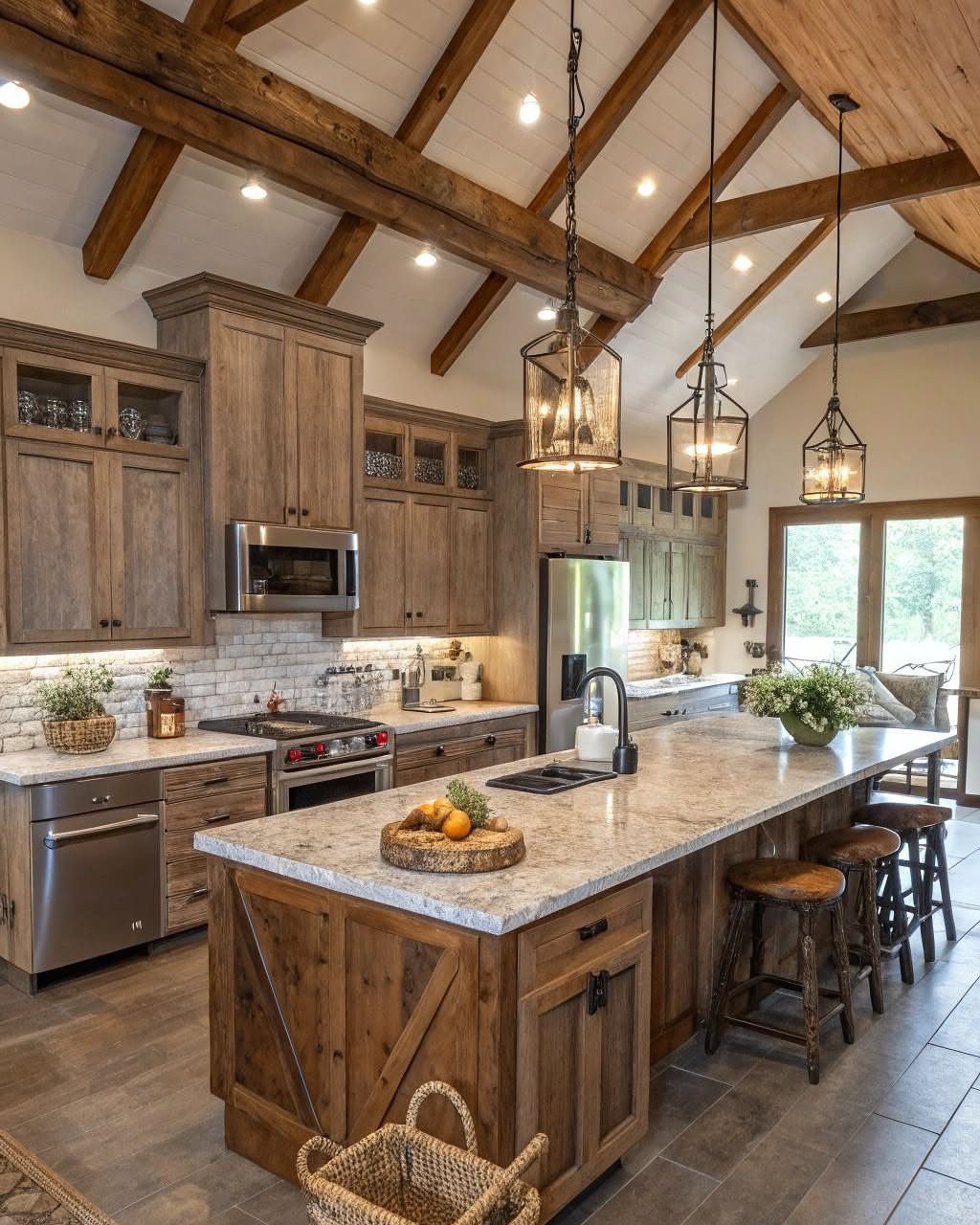
Lantern pendants in black metal, hung low over an island, put light where your hands work and cast upward to warm the ceiling plane.
3 fixtures above a long counter, as above, divide the surface into zones: prep, plating, and the far end where someone sits.
The black reads as period appropriate without requiring actual age. Open or seeded glass shades spread light through a room; opaque ones direct it all downward and leave the upper half flat.
Dimmable bulbs are worth the small cost. Full brightness for cooking, low for the hour after dinner when the kitchen becomes a sitting room.
13. Pot Rack
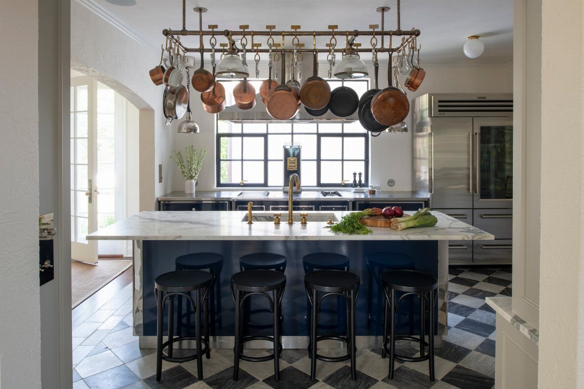
A ceiling-mounted rack turns cookware into display, freeing cabinet space for items you do not want to dust. Brass rail with S-hooks lets you rearrange as the collection grows; fixed loops look tidier but limit what fits.
Copper hangs lighter than cast iron, so I check the anchor rating before loading it. A rack centered over an island, as above, keeps pans clear of traffic paths.
The marble counter below takes the occasional drip; wood counters need a landing pad.
14. Hanging Herbs
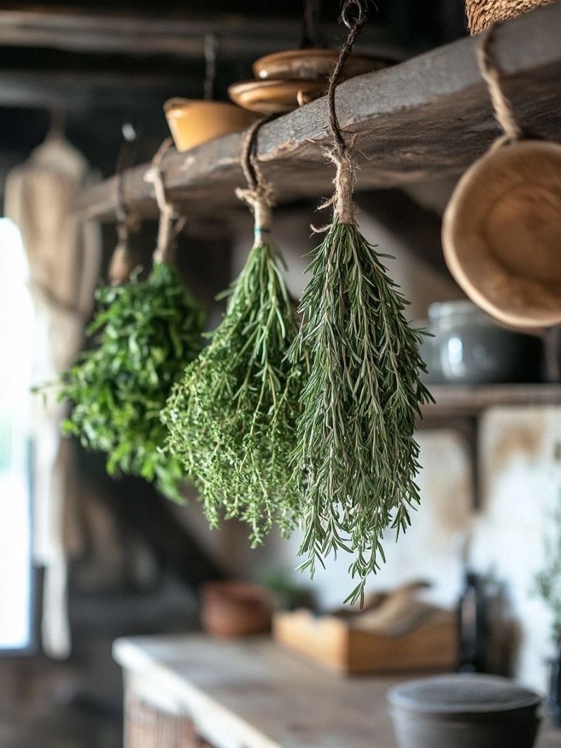
Twine bundles from a beam or shelf rail dry herbs where air moves and you see them daily. Rosemary, thyme, and oregano hold shape dried; basil goes black and slimy, so I leave that for fresh use only.
Tie stems in small bunches, stems up, leaves down.
Crowding traps moisture and invites mold. A week at room temperature, out of direct sun, leaves most leaves crisp enough to strip.
The rustic look works best when the kitchen already has wood tones to pick up; in a glossy modern space the same bundles read as stage dressing.
15. Large Wooden Table
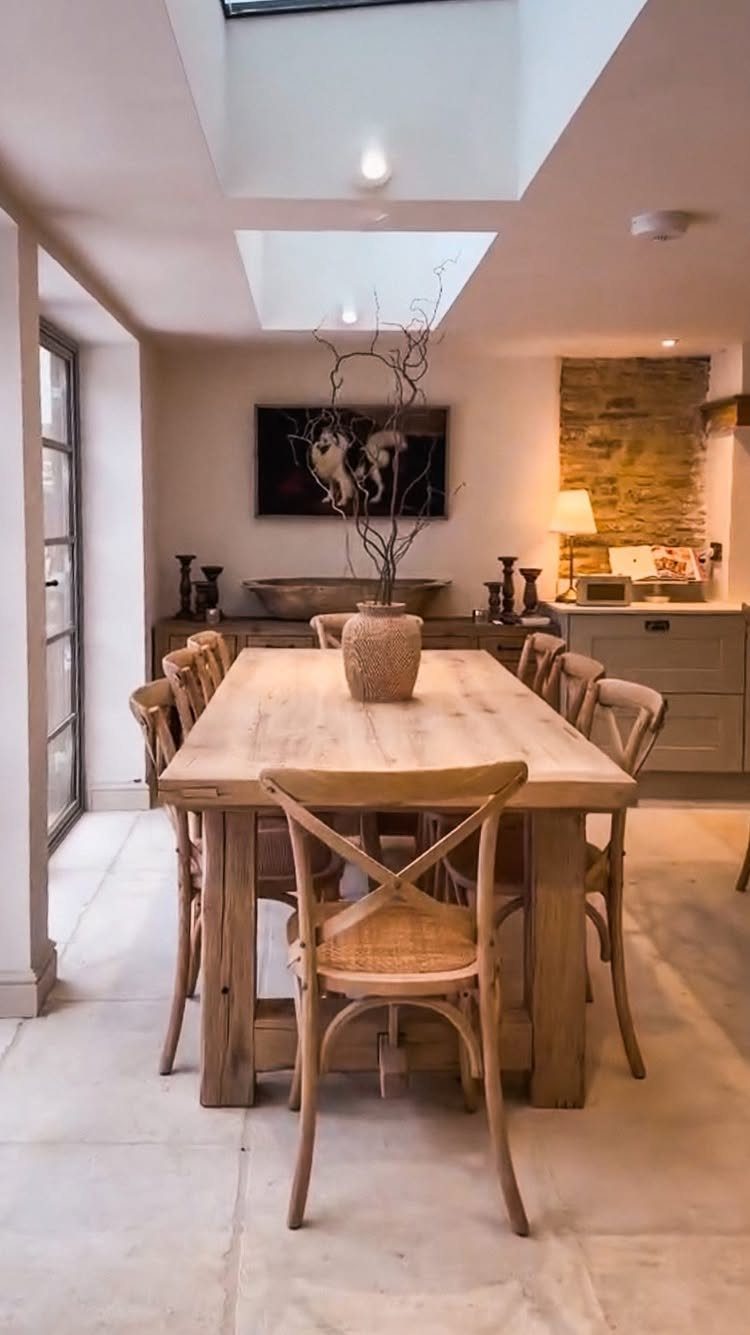
A single long table does the work of island and dining surface both, which matters when the kitchen opens to the living area and you want one gathering place.
Cross-back chairs with woven seats, as above, stay comfortable longer than solid wood without cushions.
Light oak or ash reads as country without the heaviness of walnut. The scale should leave enough room clear on all sides for chairs and passage; anything tighter and the room fights itself.
I would seal the top with oil rather than film finish; it scars more honestly and repairs with sandpaper and a rag.
16. Checkerboard Flooring
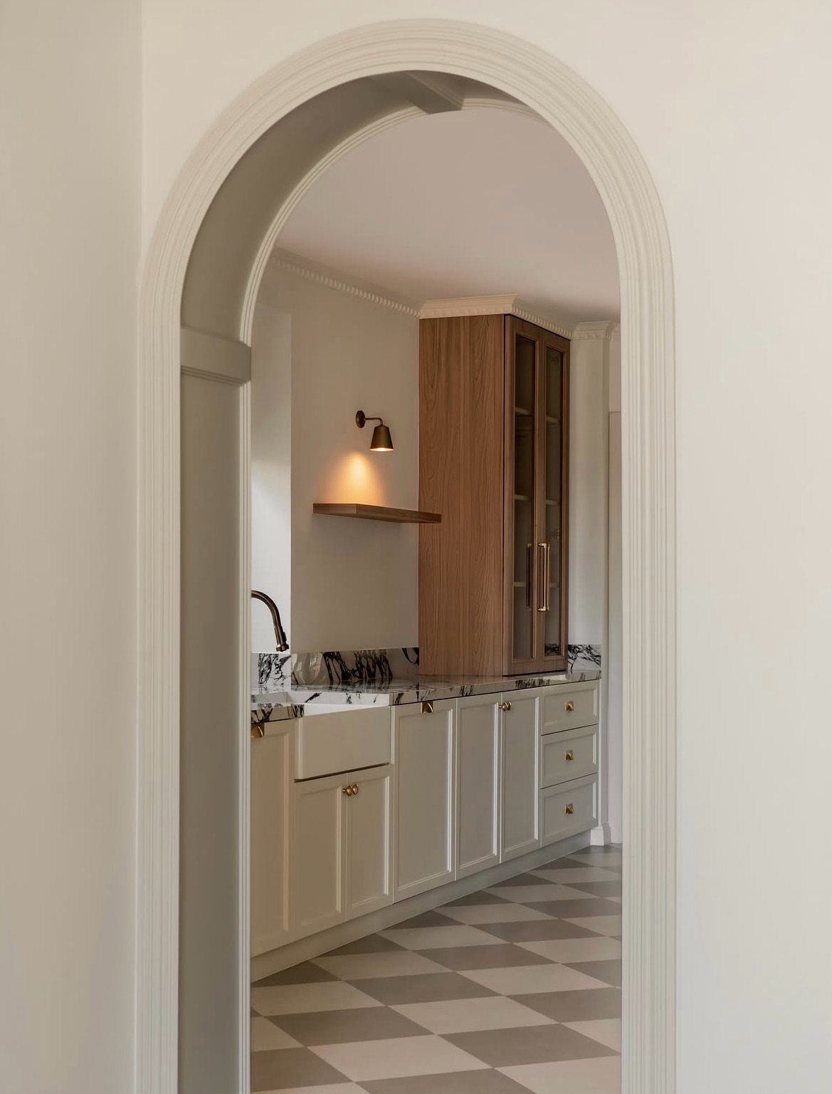
Grey and white, as above, softens the high contrast of classic black and white and carries less visual weight in a smaller room.
Larger squares set on diagonal make the pattern feel larger; straight lay reads more static. Grout in the darker tone hides the traffic line that develops at doorways.
This floor shows every crumb, which I consider a feature: you sweep more often and the kitchen stays cleaner. In a house with dogs, that visibility pays off fast.
17. Exposed Beams
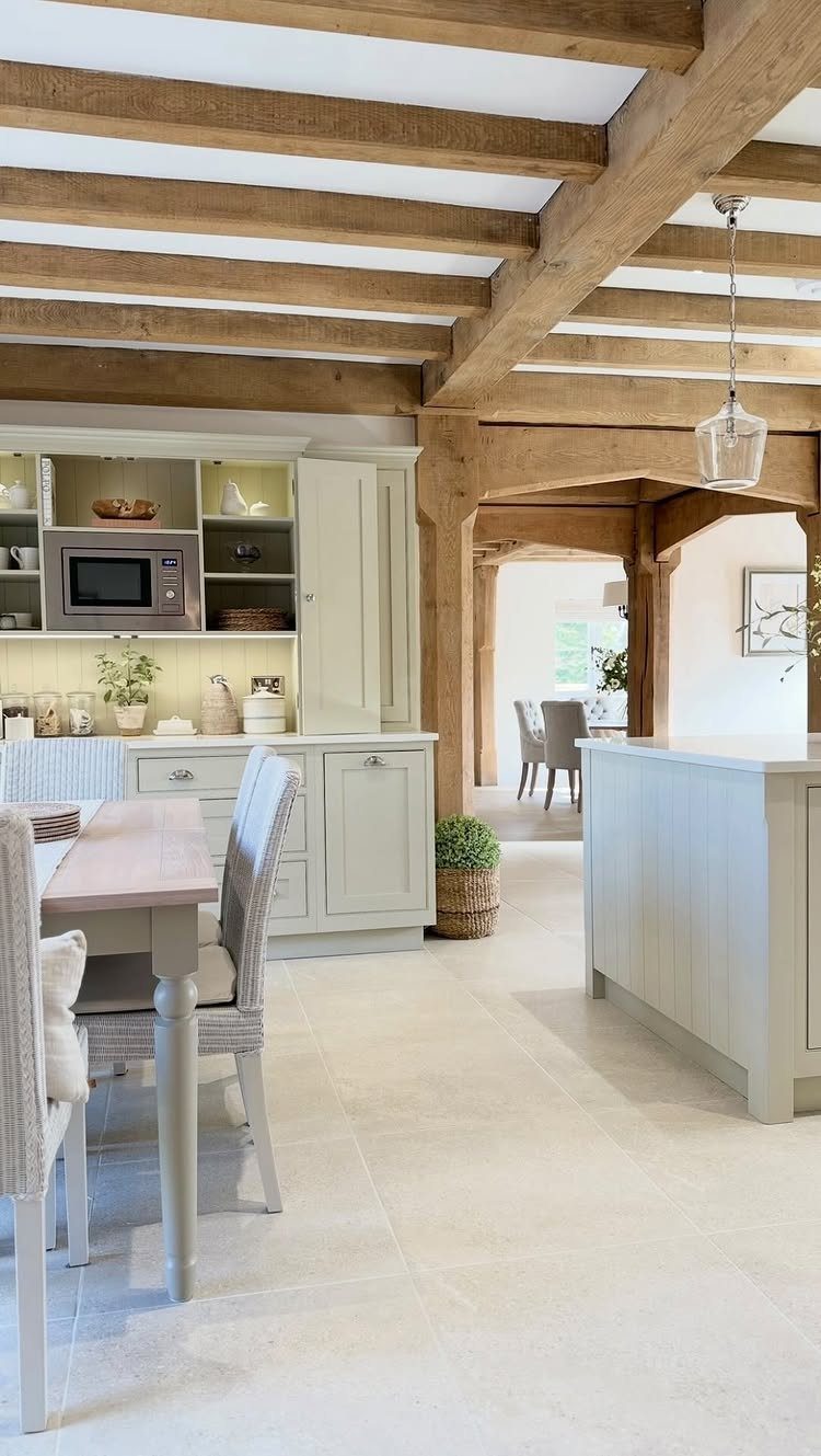
Structural or boxed-in beams painted to match the wood tone give a ceiling its architecture back. Light oak against white plaster, as above, keeps the room bright; dark beams in a low-ceilinged space can feel oppressive.
The support posts matter as much as the beams.
A post at the counter corner defines the kitchen zone without a wall. I would wrap any actual structural steel in wood rather than paint it to look like timber; the eye catches the flatness.
Fake beams cost less but sound hollow when you tap them, something a tall guest may notice.
18. Butcher Block Countertops
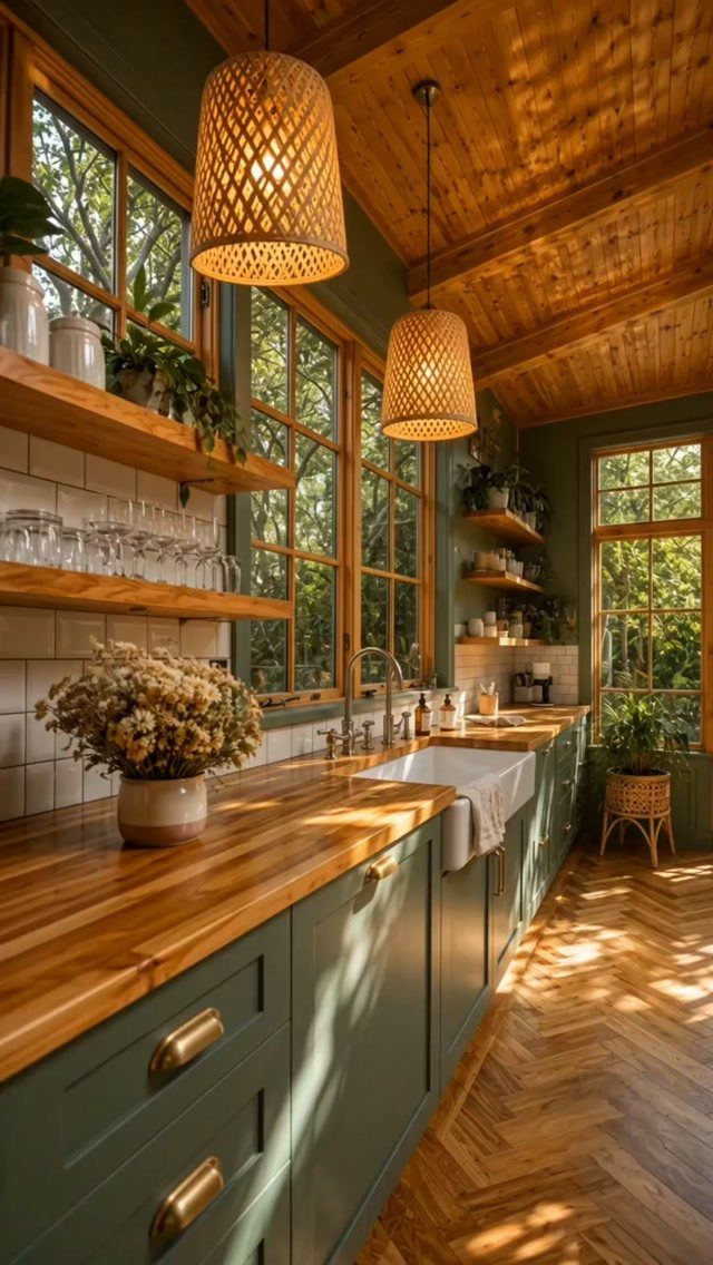
Wood counters warm a painted cabinet run the way stone cannot. Maple and oak take abuse best; walnut looks richer but dents more easily under heavy pots.
Oil finish needs reapplication every few months near the sink; mineral oil is food-safe but never cures, while polymerized tung oil dries hard and smooth.
I keep a bottle with the cleaning supplies and wipe on a thin coat when the wood looks dry, which is more often than the calendar says.
Butcher block warms fastest against color; I like garden-greens with it, though cream or black work too. In a darker kitchen I would reverse the balance: light counters, deep cabinets.
19. Tongue and Groove Wood Paneling
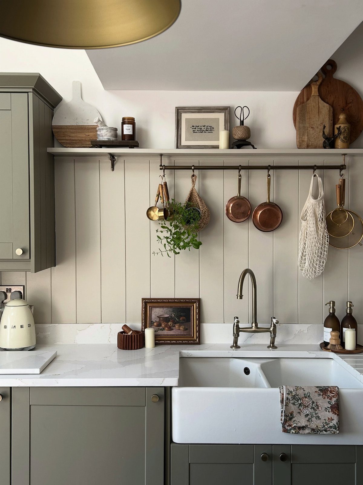
Vertical tongue and groove paneling behind a sink puts the wood where water splashes without the warping risk of a full wall.
The tight fit of the joint sheds moisture better than shiplap’s overlap, and the groove casts a thin shadow line at each board.
Painted or sealed, the boards need re-sealing at the sink edge every couple of years.
I would run the boards floor to ceiling only in a kitchen with generous height; in standard rooms, stop at the upper cabinet line to keep the proportion.
20. Decorative Plates
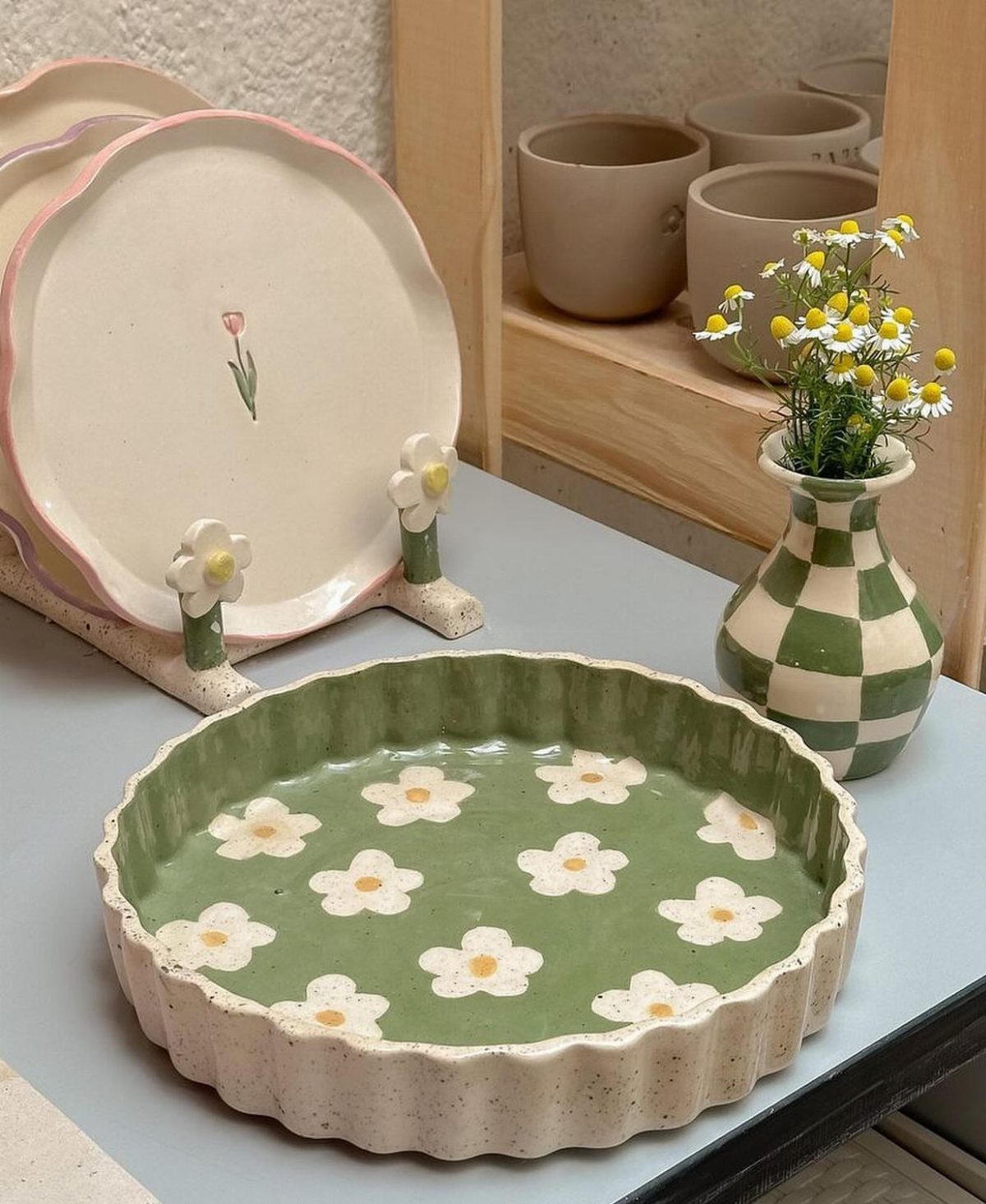
A plate leaned on a counter or hung in a row breaks the flat plane of painted cabinets the way a painting would, but with lower stakes; chip it and you have a spare.
Floral patterns read as collected rather than matched when sizes vary.
I limit mine to one shelf or one wall. Scatter them across every surface and the kitchen becomes a gift shop.
A wire stand on a counter needs no hardware; for walls, plate hangers in spring steel grip without adhesive that can fail in kitchen humidity.
21. Checkerboard Backsplash
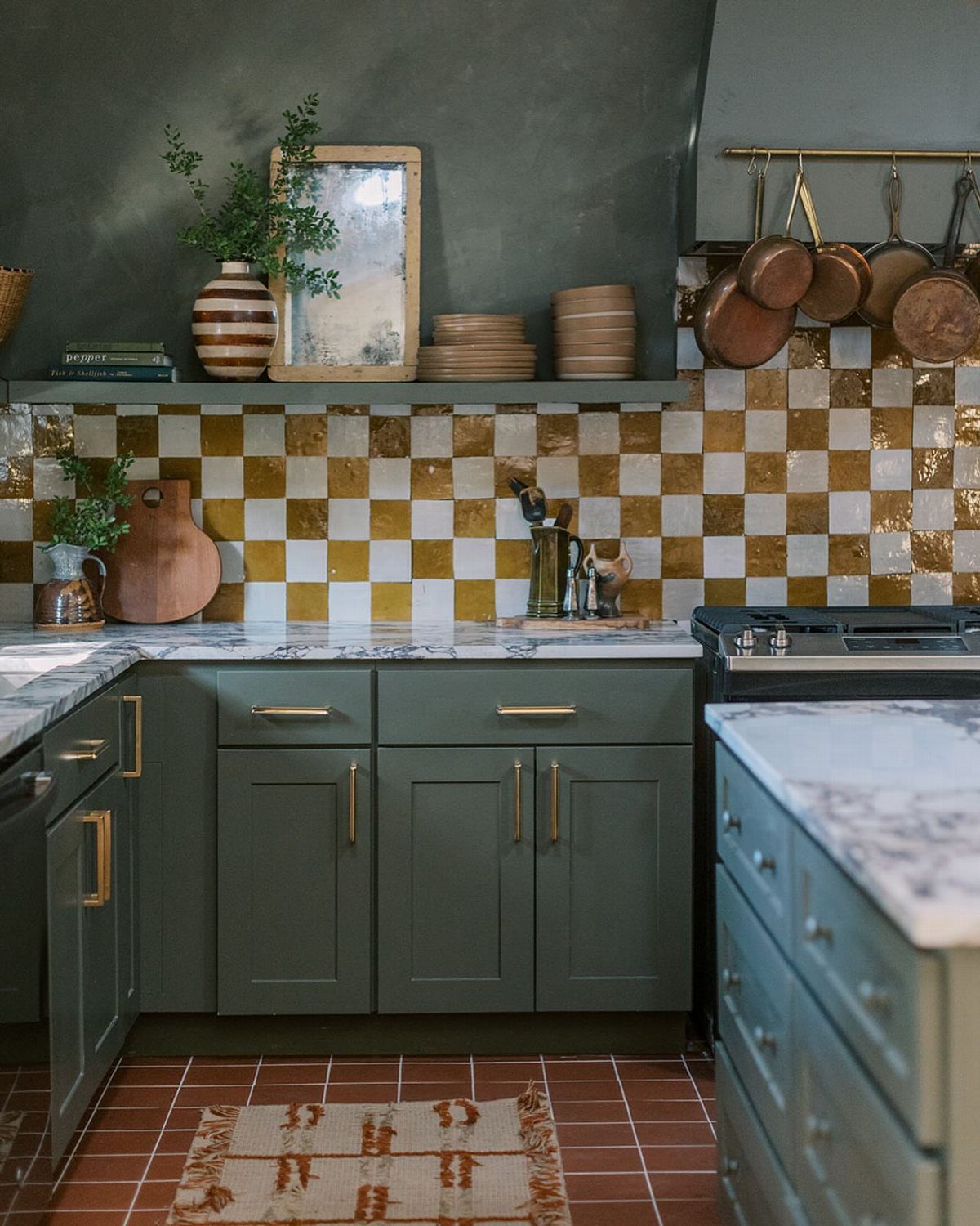
Gold and white tile behind a stove carries the checkerboard idea from floor to eye level, which works because the scale is smaller: small squares read as texture, not as the bold floor pattern shrunk down.
The metallic catches under-cabinet light and brightens a dark cabinet run.
Grout in white keeps the pattern crisp; gold grout would muddy it. I would use this only on the wall behind the range, not wrapping the whole room; the eye needs a place to rest.
Small-format tile costs more in labor than material; budget for the setter’s time.
Common Mistakes in Farmhouse Decor
I see this most often when someone strips out color and texture in pursuit of cleanliness, then wonders why the room feels like a showroom.
Theme-heavy decor works against you too.
Literal farm signs, rooster motifs, or distressed everything reads as costume, especially in a house that was never a working farm. The style works when it looks gathered, not purchased as a set.
Overloading rustic features is the mirror mistake.
Too much reclaimed wood, too many wrought-iron fixtures, and the room becomes a stage set. Modern function matters: a kitchen that looks authentic but lacks counter space or decent lighting fails daily use.
The safe middle is adding depth through contrast.
Warm neutrals with one darker tone, one natural material against painted surfaces. Personality comes from restraint, not accumulation.
Best Colors for a Country Kitchen
Soft whites and creams keep a country kitchen bright without the coldness of pure white. Beige and warm wood tones layer in the coziness that separates country from farmhouse minimal.
I like earthy shades for the elements that anchor the room. Sage green, muted blues, natural wood finishes: these read as found rather than chosen, which is the whole point of the style.
Jeff Andrews starts with black and white, then builds.
Hunter greens, buttercup yellows, burnt oranges: colors drawn from outdoors rather than a trend forecast. The yellow against reclaimed wood surprised me when I first saw it, but the warmth makes sense against gray-brown timber.
The palette stays muted overall. Even a vibrant accent needs desaturation to read as country rather than contemporary.
Creating a Country Kitchen
Natural materials are the foundation.
Wood, stone, cotton, linen: these age visibly and the wear becomes part of the room’s character. A kitchen that looks finished on day one looks wrong; I want a space that looks better once it has settled in.
Soft textures balance the hard surfaces.
A mix of finishes, matte and slightly worn, keeps the eye moving without busyness. I would avoid anything too polished or too matching.
The layout matters as much as the look.
Country kitchens center on gathering, which means clear paths to the table, space for someone to lean against a counter while another cooks, and seating that faces inward rather than toward a wall.
Practical design is not separate from comfort. Drawers that close softly, shelves at reachable heights, a sink where you can stand without blocking traffic: these details let the room feel rooted because they let it function without thought.
Frequently Asked Questions
What is a country kitchen style?
A country kitchen is warm, simple, and built to look lived-in from the start rather than finished on day one.
Wood cabinets, open shelving, and natural materials like stone and cotton give it the handcrafted feel that separates it from sleeker styles.
The colors stay quiet and pulled from the ground: chalky white, cream, the gray-green of dried sage, and wood that looks like it came in with the walls rather than got picked from a sample board.
What are some ideas for a country kitchen in 2026?
Natural materials still anchor the look: butcher block counters, tongue and groove paneling, and reclaimed wood beams add character that ages visibly.
One saturated hue against a field of warm neutral, a forest green island on oatmeal cabinets for instance, gives the kitchen its structure without asking pattern to do the work.
A black range with brass hardware, or another appliance that reads modern under the hood and old under the knobs, keeps dinner moving while the room keeps its story.